From habitat magazine - issue 39, new neutrals
Our collective taste in neutrals is evolving, and our confidence in colour is growing too.
Neutral colours are perennial favourites with versatile monochrome shades like Resene Merino and Resene Grey Friars often appearing in the top 20 list of most popular shades.
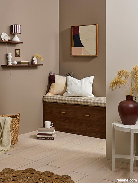
Layering similarly toned warm browns keeps this space neutral but adds plenty of visual interest.
Left wall painted in Resene Jetsam Brown, rear wall in Resene Soya Bean, front wall in Resene Sandspit Brown, bench seat and shelf stained in Resene Colorwood Bark, floor in Resene Colorwood Breathe Easy, side table, lamp base, vases and cup in Resene Albescent White, vase in Resene Warmed Brown and books in Resene Jetsam Brown, Resene Albescent White and Resene Warmed Brown from the Karen Walker Paints collection. Cushions from Baya, basket from Bed Bath & Beyond, artwork from A&C Homestore, bench seat from Adam Van Sambeek.
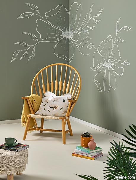
Soft greens work well with more traditional creamy neutrals for a look that echoes the colours of nature.
Walls painted in Resene Ravine with mural and floor painted in Resene Quarter Linen, skirting in Resene Sea Fog, cup and saucer in Resene Half Rivergum, vase in Resene Summer Rose and planter in Resene Kombucha. Chair from Container Door, throw from A&C Homestore, cushion from Fledge and Thread.
top tip Like any colour, bolder neutrals can change in different light conditions, so be sure to try your colour out using Resene testpots or Resene A4 drawdown paint swatches and view at different times of the day and night and in both natural and artificial light before committing to your palette.
However, our collective taste in neutrals is evolving, and our confidence in colour is growing too. Today’s new neutral trend goes beyond monochrome palettes to warmer, deeper shades that add colour and flair while keeping the versatility, style and sophistication we love about neutrals. Think dusky reds like Resene Coral Tree, muted ochres such as Resene Double Sisal, soft greens like Resene Pumice and yellow oxides such as Resene Tussock.
Whether you’re adding notes of a coloured neutral to an otherwise grey, white or cream colour palette, or going all-in with layers of analogous shades, these bolder neutrals can be a ‘safe’ way to begin experimenting with a touch of colour in your home.
Adding bolder neutrals to your palette brings the simple benefit of making spaces more inviting, says Resene Colour Expert Jackie Nicholls.
“Choosing neutrals with more depth to them can make a massive difference to the feeling of a space. More complex neutrals have interesting undertones that can help pull a scheme together.
“If you’re drawn to soft furnishings with a green slant for example, they will nestle best against neutrals with a similar undertone such as Resene Quarter Parchment. If you have dusky pinks, tan and chocolate-coloured furnishings, something like Resene Quarter Akaroa, with a taupe undertone, helps pull them all together.
“Always look at your Resene paint colours with your furnishings, flooring and accents to see how they work together.”
Jackie says bolder neutrals have a complexity and softness that can lend a room a more ‘high-end’ finish, and will often recede from the eye, making them ideal for smaller spaces or as a backdrop that allows key decor pieces to shine.
She suggests painting A2 sheets of card (leaving a 2cm wide unpainted border) with Resene testpots in different bolder neutral shades. Place them behind a favourite piece of furniture or artwork to see what really makes it pop. “More often than not, a deeper colour will create the best effect,” she says.
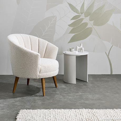
A large-scale mural in light character neutrals adds drama without busyness.
Mural wall painted in Resene Double White Pointer, Resene White Pointer, Resene Half White Pointer and Resene Proton, floor finished in Resene Dune with a faux painted concrete finish using Resene FX Paint Effects Medium mixed with Resene Greige, coffee table and tri vase in Resene White Pointer and cup in Resene Double White Pointer. Chair and rug from Nood.
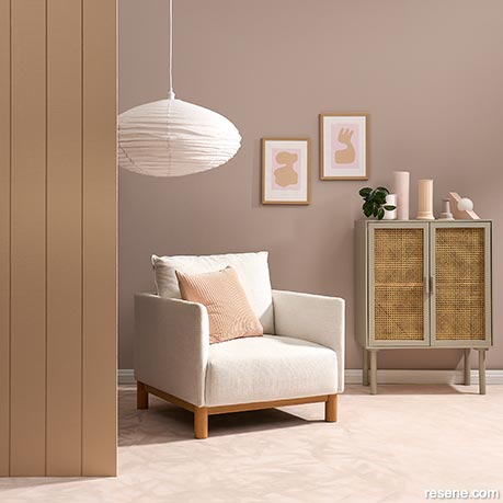
Soft dusky pinks add warmth and depth to this natural palette.
Rear wall painted in Resene Martini with tongue-and-groove side wall in Resene Cashmere, floor in Resene Dust Storm colourwashed with Resene FX Paint Effects Medium mixed with Resene Cest La Vie, skirting in Resene Snow Drift, sideboard in Resene Greige with plant pot in Resene Snow Drift and vases in, from left, Resene Dust Storm and Resene Cashmere. Chair from Danske Møbler, lightshade from Corcovado, art from endemicworld.
did you know? If you need help finding just the right new neutrals for your home, Resene colour experts can help you narrow down your colour and wallpaper choices. Book a Resene Colour Consultation, instore, virtually or an at home visit (selected areas). Or ask the experts at your local Resene ColorShop or use the free online Ask a Resene Colour Expert service.
Paying attention to the undertones of any other traditional neutrals you’re using in your space will help you narrow down which bolder neutral colours to try, says Resene Colour Expert Meryl Southey. Each Resene colour has a code starting with an R (red), O (orange), Y (yellow), G (green), B (blue), V (violet), BR (brown) or N (neutral) to help with this.
“Look to see if your traditional neutrals have hints of pink, green or yellow, for example. Noticing these variations allows you to play off that undertone with the other colours you layer on top. Try neighbouring colours on the Resene colour palette cards which have similar undertones but aren’t exactly the same variation of that neutral – this creates a more interesting palette,” Meryl says.
“Any colour can be subdued and appear neutral when combined with the basics such as greige, white or beige, and spreading the colour throughout the space with varying strengths, reduces the impact of a bolder colour, while still creating interest.”
If you want to create a monochrome effect with coloured neutrals, look to add visual interest with the use of texture, pattern and colour through Resene wallpapers, wood stains or paint effect finishes, Meryl suggests. And consider using your bolder colours in less expected places like the floor and ceiling, paired with wallpapers or painted walls in more traditional neutrals, to make a bold statement.
When combining different coloured neutrals, interior designer Megan Harrison-Turner says it’s best to keep to a similar colour profile or saturation.
If you’re opting for a muddy pink like Resene Cashmere, keep any other colours equally muddy or greyed off. Try pairing muted pink with smokier greens like Resene Staccato or greyed blues like Resene Duck Egg Blue, she says. “Putting a sharp clear shade next to a subtle, sophisticated ‘muddy’ colour is an instant colour killer.”
Jackie suggests trying dusky or muddied pinks like Resene Wafer or Resene Martini with leathery browns or soft caramels such as Resene Cashmere and Resene Saddle. Bring everything together with a gentle, not-too-bright white, such as Resene Half Barely There.
For warm brown neutrals, Meryl suggests Resene Coral with an accent wall in Resene Gargoyle. Complete the look with trim in Resene Thorndon Cream or Resene Rice Cake and wood stain finishes in Resene Colorwood Rock Salt and Resene Colorwood Bark.
Yellows, both bold and muted, can work well as unexpected neutrals when you get the balance right. Meryl suggests walls in Resene Lime White for a fresh base, with trim in bolder Resene Hot Toddy. Pair with deeper accents in Resene Cafe Royale and Resene Keppel.
For a soft green neutral look, Megan recommends working with either cooler silvery greens like Resene Pumice and Resene Tasman or warmer tropical greens like Resene Pale Leaf and Resene Dingley.
Whatever colour combinations you choose, warm bolder neutrals may be just the way to start experimenting with more colour in your home.


Projects: Kate Alexander, Annick Larkin, Moneuan Ryan, Melle Van Sambeek
Words: Kerri Jackson
Images: Bryce Carleton
Search habitat magazine stories
Printed copies of habitat highlights are available from late March 2024 at Resene ColorShops and resellers, while stocks last. You can view back issues of habitat magazine online.
Specifiers:
If you have an idea, project or story that you think would suit habitat, we’d love to hear from you. Please drop us an email with your details and include photos if submitting a project.
Sign up for a DIY card and Save! Australia | New Zealand
![]() Get inspired ! Subscribe
Get inspired ! Subscribe ![]() Get saving ! Apply for a DIY card
Get saving ! Apply for a DIY card
![]()
Can't find what you're looking for? Ask us!
Company profile | Terms | Privacy policy | Quality and environmental policy | Health and safety policy
Colours shown on this website are a representation only. Please refer to the actual paint or product sample. Resene colour charts, testpots and samples are available for ordering online. See measurements/conversions for more details on how electronic colour values are achieved.
What's new | Specifiers | Painters | DIYers | Artists | Kids | Sitemap | Home | TOP ⇧