From BlackWhite magazine - issue 07, red alert
Subtly nuanced and vibrant hues dominate the colour forecast for the foreseeable future.
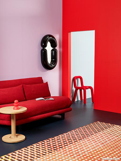
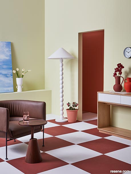
When used alone, a misty lilac like Resene Petal brings a dreamy sense of serenity. But in combination with today’s red-hot trending reds, this delicate pastel becomes an unexpected yet sophisticated option for bringing balance to bolder hero hues like Resene Amped when grounded with dependable blues like Resene Carpe Noctem and Resene Comfortably Numb.
Left wall painted in Resene Petal, right wall and chess piece in Resene Amped, back wall (through doorway) in Resene Comfortably Numb and floor in Resene Carpe Noctem. Sofa and rug from Ligne Roset, side table from Woodwrights, mirror and chair from Dessein Parke.
These days, the world can be a noisy place. No matter where you look, there’s a new advertisement, brand or social media influencer clamouring for your attention. Our brains are being pummeled with more information than ever before, and the task of trying to distil from that what the most relevant colour and design trends are for you and your clients might feel next to impossible. Luckily, staying on top of the current paint colour trends is far easier than being up to speed on the latest TikTok dance crazes. Most of the time, changes to paint colour trends occur as subtle, incremental twists that build slowly and steadily until they eventually evolve into hues that are markedly different. These more noticeable changes often take upwards of 18 months before they really become apparent.
One reason it can feel like colour trend changes are occurring more rapidly is because, during that same 18-month timeframe, you’ll have witnessed the release of three to six seasons of new fashion collection releases. In this context, we not only mean the fashion we wear on our bodies but also the release of new furniture, textile and décor collections and other things like new tech or vehicles which also rely on driving sales through newness and novelty. While colours that are popular in fashion do indeed trickle down into paint colour trends, not every single hue you see on the rack or runway from one season to the next will leave a lasting mark.
There are, however, occasions when more significant shifts in paint colour trends take place. And in times like these, a larger change is often a direct reflection of a societal shift. A recent example would be the effect that the Covid-19 pandemic had on colour and design trends. When we were forced to spend more time at home, we inevitably re-evaluated what was lacking in the look and function of our living spaces. Many of us were also tasked with working from home for the first time in our careers, so colours that promoted productivity and focus became more important. Because it was a time of upheaval and uncertainty, there arose a preference for hues that provided a soothing effect and enhanced mental wellbeing. This was underpinned by a strong nostalgia for simpler times when things were made by hand and a romantic idea that, in doing things the old-fashioned way, we would have more control over our lives. And after being isolated indoors for so many of our days, we looked for ways to bring elements of the outside in through fresh plants, natural materials and earthy hues. When you consider all these societal undercurrents acting together, it becomes far less surprising that they culminated in the calming colour palettes of warm beiges, bushy greens, watery blues and serene pastels that were the top trends at the time.
As is often the case when trends become deeply entrenched in the cultural zeitgeist, the pendulum tends to swing quickly and sharply back in the opposite direction. When the design world becomes oversaturated by one thing, you can be sure that there is a strong desire growing to counter it with another. Suddenly, instead of gentle colours that swaddle us with comfort, a dynamically different collection of exciting, energetic and vibrant hues from across the spectrum have burst forth over recent months. In many ways, this switch to more spirited shades has represented society’s strong desire to shake off the cobwebs that accumulated in our lives during the pandemic.
The takeaway from all this is that, at the end of the day, the colours we choose to decorate with are first and foremost driven by emotions. Instead of trying to play a guessing game with what you see online and evaluating on the fly whether it’s a flash-in-the-pan trend or something that’s here to stay, spend some time brushing up on colour psychology then pay close attention to the greater forces at play. If you take the time to imagine how these might affect your client (and, when relevant, their own customers), you’re likely to have an idea of how upcoming trends will take shape.
We’ll let you in on another colour forecasting secret, too. While not every single shade or tint is going to be on trend at any given moment, there is usually at least one shade or tint from every major colour family that is. So instead of fretting about whether orange is in or out this year, it’s simply about picking the Resene orange that has the right undertone, saturation and vibrancy. And for that, you have us and our biannual round up of the exact Resene paint and wood stain colours to use now and into the year ahead.
When talking about current colour trends, the one family that absolutely cannot be ignored is red. The return of red as a major paint colour trend is a prime example of the aforementioned pendulum changing direction. After spending several years being virtually irrelevant, red-hot reds like Resene Amped and Resene Roadster are the hero hues of the moment – and these show-stopping colours will have a firm hold on their prominence for the foreseeable future. For those looking for slightly less intensity, Resene Thunderbird is a fantastic on-trend option that’s bright without being too shouty. Or go for deeper, saturated ruby, wine and brown-edged tones like Resene Pohutukawa, Resene Aroha, Resene Incarnadine, Resene Scoria and Resene Pandemonium.
As we look ahead, design professionals can embrace the diverse palette of colours emerging and incorporate them thoughtfully to create spaces that resonate emotionally with the evolving needs and desires of clients. Whether it’s invigorating reds, soothing lilacs or metallic accents, paint colour trends are poised for another year of bold innovation, creativity and excitement.
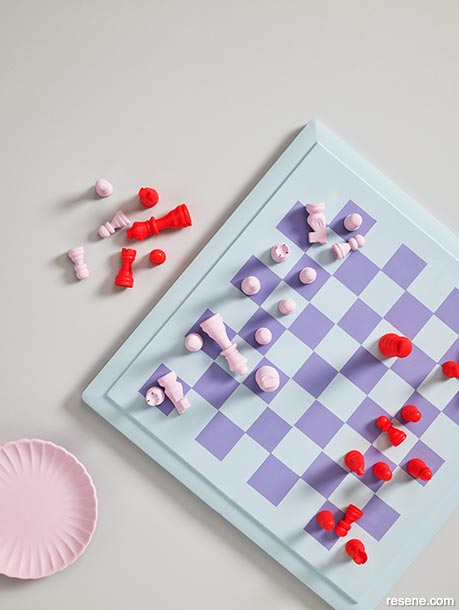
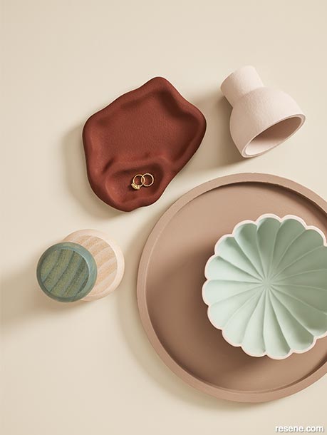
Background painted in Resene Ted, chess board in Resene Comfortably Numb and Resene Heliotrope, chess pieces in Resene Petal and Resene Amped and plate in Resene Petal.
Lower sheen finishes are popular for today’s youthful vibrant hero hues. Since flatter finishes reflect less light back at the viewer, it can make it easier to perceive the paint colour’s complex undertones.
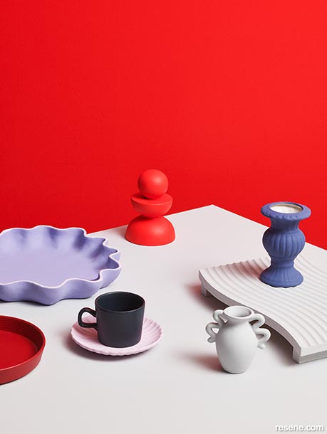
Wall and chess piece painted in Resene Amped, tabletop in Resene Ted, round plate in Resene Pohutukawa, wavy plate in Resene Heliotrope with trim in Resene Petal, mug in Resene Carpe Noctem with saucer in Resene Petal, tall vase in Resene Rulebreaker and amphora vase and tray in Resene Ted.
Earthy brick and terracotta reds such as Resene Savour, Resene Pioneer Red and Resene Soiree will also hang on to their trend-worthiness throughout the year ahead. These warm and grounding colours can be used as accent walls or in furniture and décor elements to infuse energy into interior spaces. As the statement hue within a soft palette of cream, beige, taupe, pink and blue green comprised of paint colours like Resene Half Tea, Resene Foundation, Resene Otter, Resene Contented and Resene Eau De Nil, earthy brick and terracotta red hues can bring a touch of depth to an otherwise airy palette.
There is nothing quite like using red as part of a full throttle, colour-drenched look, where virtually every surface of a space gets steeped in one or more variations of this unmissable hue – especially when lush velvet textiles get added to the mix. Just be sure to pick the projects you use red in carefully and pay close attention to how you light them. As a colour proven to be one of the most appetising options, it’s an amazing choice for a restaurant or bar. However, large quantities of some reds can be too strong to spend long periods of time around when trying to work or relax.


With a few notable exceptions, green hues are far less popular right now than they have been over the last three years. Green played an important role comforting us during the pandemic, but after being a top trending colour for nearly a decade, society is ready to see something new.
While some other colour families will be going through more pronounced changes, the few versions of green that will continue to be relevant are expected to remain quite stable. Vibrant verdant greens like Resene Aloe Vera and Resene Boundless are the statement colours to look to when you want to imbue your project with a fresh burst of energy. These hues are perfect for spaces where you want to infuse life and vitality, such as a restaurant, commercial office, school or daycare. Combine them with botanical prints and indoor plants for a classic tropical feel or use them with lilac, burnt orange and yellow-edged white such as Resene Petal, Resene Clockwork Orange and Resene Rice Cake for a youthful and energetic palette.
We’ll soon see the return of deep, dark bush greens with a brown edge like Resene Off The Grid and Resene Top Notch as well as slightly bluer versions like Resene Welcome. Muted midrange tones like Resene Contour, Resene Nirvana and Resene Green Days will remain stable, as will today’s popular pale tones like Resene Springtime and Resene Transcend. If your project is a long way from completion, keep greens like Resene Good To Go and Resene Field Day in the back of your mind as we should see them start to resurface in about 18 months’ time.
When real estate and cost of living is at a premium, there is an increased need for adaptable spaces with a focus on multifunctionality coloured with versatile shades that can serve as backdrops for the room’s different purposes. Rather than using a single colour for all the walls in an open-plan space, we’ve been seeing more diversity being used to break larger rooms into different zones and enhance architectural features.
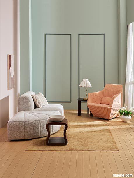
Back wall painted in Resene Eau De Nil with timber moulding finished in Resene Colorwood Rising Tide, left wall in Resene Contented, floor in Resene Colorwood Bask, bowl painted in Resene Half Tea and textured artwork in Resene Contented, Resene Trek and Resene Otter with frame in Resene Colorwood Bask. Sofa and ottoman from Soren Liv, armchair and end table from Ligne Roset, cushion, lamp and vase from A&C Homestore, side table from Woodwrights, rug from Baya.
As trends like self-care and quiet luxury continue, soft pastel shades like pink, lilac and blue are calming and tranquil yet endlessly sophisticated – offering a creative alternative to more predictable neutrals.
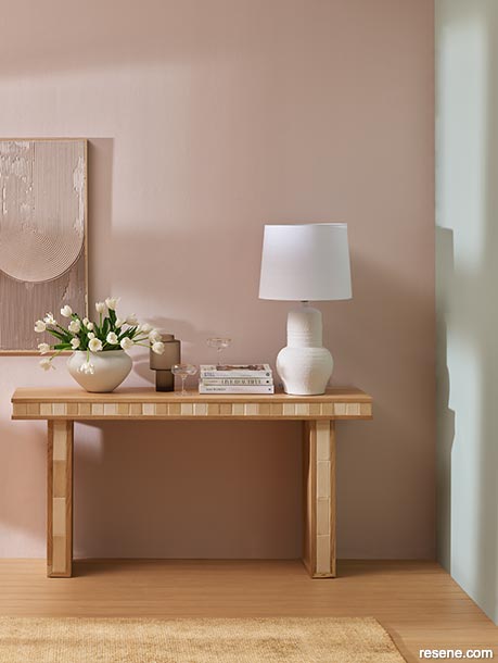
Back wall painted in Resene Contented, right wall in Resene Eau De Nil, floor finished in Resene Colorwood Bask and textured artwork in Resene Contented and Resene Otter with frame in Resene Colorwood Bask. Console table and lamp from Soren Liv, rug from Baya, wide vase from A&C Homestore, glass vase from Ligne Roset.
Warm and earthy browns like Resene Trek and Resene Otter bring a sense of grounded elegance to any space. When backed with a nuanced neutral like Resene Half Tea, soft pinks like Resene Contented and powdery green blues like Resene Eau De Nil, this colour palette puts a fresh twist on organic chic. Use them in combination with colourwashed wood to create a fun yet harmonious nature-inspired ambiance.
Background painted in Resene Half Tea, organic textured dish in Resene Trek, small vase in Resene Contented, large round tray in Resene Otter, scalloped bowl in Resene Eau De Nil with trim in Resene Contented and wooden coat hook finished in Resene Colorwood Rising Tide and Resene Colorwood Becalm.


As we experience and bear witness to the effects of climate change, increased environmental concerns have driven a growing interest in sustainable design. Building and decorating with natural, eco-friendly materials has in turn created more demand for earthy, organic colour palettes, which have gained prominence among those who seek to reduce their carbon footprint and create spaces that connect with nature. So, despite the wide array of exciting and bold paint colours that are vying for you and your client’s attention, rest assured that there are still plenty of gentler options on the table.
The health and wellness themes that rose to prominence in recent years will also continue to be a top influencer of colour and design trends. Elements that promote relaxation, stress reduction and mental wellbeing continue to be highly desirable additions to residential homes, spas, cafés, restaurants, hotels, commercial offices and healthcare facilities along with the incorporation of elements pulled directly from nature, like indoor plants and timber. Along with those previously mentioned earth-inspired tones of green and terracotta, lighter blues reminiscent of clear skies and tranquil waters such as Resene Timeless and Resene Comfortably Numb continue to be favourites for evoking a sense of calm and serenity and promoting relaxation and stress relief in these types of projects.
On interior timber surfaces, natural-look wood stains like Resene Colorwood Natural and Resene Colorwood Rock Salt are top interior choices for projects aiming to tap into the biophilic design trend, as these colours can help provide an added layer of protection from moisture and UV without dramatically changing the wood’s inherent beauty. However, we are also seeing growing interest in Resene’s collection of timber colourwashes such as those from the We Speak Beach collection, including Resene Colorwood Bask, Resene Colorwood Breathe Easy, Resene Colorwood Rising Tide and Resene Colorwood Becalm – which enhance the look of wood through their soothing, softly-pigmented finish.
On exterior wood cladding, the strong appetite for black and off-black timber stains remains, with colours like Resene Woodsman Pitch Black, Resene Woodsman Charred Black, Resene Woodsman Crowshead and Resene Woodsman Tiri being top preferences. When specifying dark hues, be sure to always ask for a Resene CoolColour formula to protect your substrate and help reflect more harmful UV rays away from your stained or painted surface.


Beyond the paler blues we spoke to earlier, complex aquatic blues are key colours for the year ahead. From deeper versions like Resene Ocean Waves and Resene Aviator to bolder tones like Resene Boost, Resene Wet N Wild, Resene Now Or Never and Resene Island Time, aqua and cerulean blues will be the reigning on-trend choices for the coming year. Looking further ahead though, expect to see the popularity of the more vibrant aqua options wane while classic greyed blues like Resene Lakeside and Resene Duck Egg Blue will hold fast in the colour trend forecast.
For projects that need something a bit different, purple-edged periwinkle blues like Resene Heliotrope and Resene Sail Away remain interesting alternatives to more classic options. They can be used as a point of difference amongst timeless tones or in otherwise neutral colour schemes. But they can also make a cheerful counterpoint to balance today’s bold and brilliant reds. Less risky but still interesting nonetheless, popular deep midnight blues like Resene Carpe Noctem offer more complexity than a run-of-the-mill black might – making them a sophisticated yet distinctive choice for joinery or flooring, especially when complemented with elegant metallic accents to add a touch of luxury. Or use them to create a cocooning effect on major surfaces like the walls, ceiling and trim to build intimacy in media rooms, theatres, restaurants, bedrooms or living spaces.


If we could give away a crown to the colour family that has the widest range of trend-worthy tones, it would be pink. From classic rose pinks like Resene Summer Rose and Resene Awaken to peppy pastel pinks like Resene Inspire and Resene Valentine to Barbie-worthy magentas and bubblegum pinks like Resene Drop Dead Gorgeous and Resene Coconut Ice, there aren’t really any wrong choices when it comes to on-trend tones.
Lilac-edged purple pinks like Resene Petal continue to be affectionate favourites among younger clients, though this and similarly delicate shades are expected to be among the first pinks to drop from the colour forecast. However, peach and papaya pinks from dustier orange versions like Resene Dawn Glow through to juicy brights like Resene Tropical are showing to have more staying power – likely because of how many other trending hues they work with. These colours can make excellent pairings for bold blues like Resene Aviator, burnt oranges like Resene Clockwork Orange, blush beiges like Resene Foundation, saturated dark reds like Resene Pandemonium and more.
Depending on what they’re paired with, rich reds like Resene Scoria can feel anywhere from casual and earthy to downright elegant.
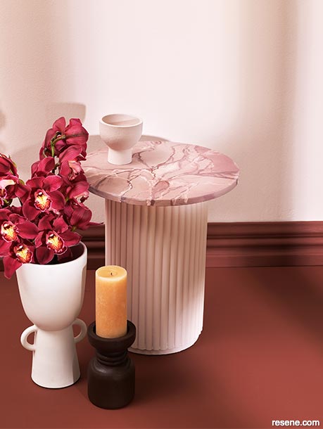
Use these hues in a dining space with timber furniture stained in Resene Colorwood Bark, marble accents and Art Deco-inspired details for ultimate opulence. Wall, bowl and table base painted in Resene Contented, floor and skirting board in Resene Trek, hand-painted faux marble effect tabletop in Resene Contented, Resene Trek, Resene Otter and Resene Half Tea, vase in Resene Half Tea and candlestick holder finished in Resene Colorwood Bark.
Pop culture and the entertainment industry often inspire interior design trends. Among clients, things like TV shows, movies, major artwork exhibitions and celebrity homes can influence colour choices and design styles and become a key inspiration for projects.
Main walls painted in Resene Springtime, hallway wall in Resene Dawn Glow, floor in Resene Scoria and Resene Alabaster, vases in (left to right) Resene Alabaster, Resene Scoria and Resene Thunderbird and plant pot in Resene Summer Rose. Chair, side table and lamp from Bauhaus, console table from Mocka.


It’s no secret that cool greys are more-or-less gone from the short and long term paint colour forecast while warm neutrals like cream, beige, taupe, greige and brown have become the definitive neutrals to use when you’re after a backdrop that can be easily layered with various accent colours and textures. For clients that still aren’t ready to say goodbye to grey, warm variations with complex undertones – from lighter options such as Resene Kinship and Resene Stepping Stone to mid-tones like Resene Hindsight and Resene Tino Pai through to deeper Resene Outlaw, Resene Kia Kaha and Resene Rocky Point – are the options to suggest. These versions offer plenty of opportunities to update classic colour schemes and blend beautifully with other warm and complex character neutrals like Resene Half Tea, Resene Thorndon Cream, Resene Otter, Resene Courtyard, Resene Foundation and Resene Domino.
Even the very darkest neutrals on the spectrum have been influenced by the switch to warmer neutrals, as many of the top trending varieties of black carry a hint of warmth to them. Look to blacks like Resene Black Sand, Resene Boris, Resene Thunderstorm, Resene Night Magic and Resene Invincible in circumstances where you want to reduce the jarringness that contrasting accents in a pure black can result in, which can detract from the soothing effect of gentler colour combinations.


True yellows and oranges haven’t played major roles in colour trends as of late, but this is likely to change based on longer-term outlooks. For those wanting to get an early start with the harvest golds and burnt oranges that we expect to become increasingly relevant, there are several bold yet cosy choices to consider. Paint an accent wall in Resene Clockwork Orange or Resene Liquid Gold for an inviting hospitality or social setting if you’re looking to be an early adopter. Pair these hues with warm wooden furniture finished in Resene Colorwood Bask and gold accents in Resene Gold Dust metallic to bring a luxurious touch.
Buildings and furnishings that play with people’s ideas of perception and unconventional explorations of materials and forms are growing as art and design trends. Gain control over the different surfaces throughout your project by using a range of finishes, such as gloss and matte, or add painted effects, designs, patterns and textures.
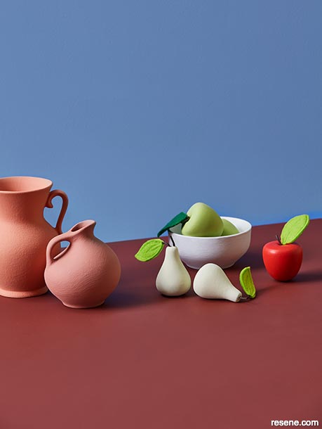
Background painted in Resene Sail Away, tabletop in Resene Scoria, vases in Resene Dawn Glow (left) and Resene Summer Rose (right), bowl in Resene Alabaster, pear ornaments in Resene Springtime and apple ornaments in Resene Staycation (in bowl) and Resene Thunderbird (right). Projects by Amber Armitage, images by Wendy Fenwick.
With an increasing focus on biophilic design, incorporating elements of nature into projects will remain relevant. While browns and greys are often the first paint colours that come to mind for such spaces, don’t overlook other earth-inspired hues from the sea, sky, bush and garden as a way of promoting wellbeing within our built environments.
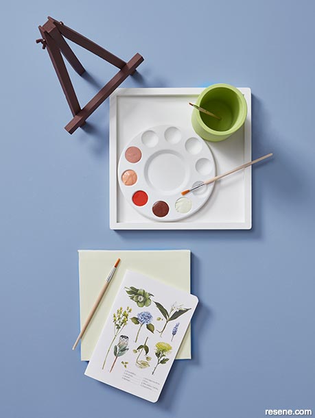
Background painted in Resene Sail Away, tray and palette in Resene Alabaster, paint wells filled with (from top left) Resene Summer Rose, Resene Dawn Glow, Resene Thunderbird, Resene Scoria and Resene Springtime, cup in Resene Staycation, canvas in Resene Springtime and easel in Resene Scoria.
Other harvest-inspired options include warm grain browns like Resene Amaranth or golden-toned ones like Resene Salted Caramel, which are both easy to fall in love with. Acidic yellows with greener undertones like Resene Funk, Resene Illuminate and Resene Tarzan will likely seem less approachable for some clients and are not suitable for all project types, but they are going to continue to be relevant for next year and into 2025.
No matter which colours designers choose to use on the projects they complete over the months ahead, we expect there will continue to be a strong preference for specifying them in low sheen and matte finishes like Resene SpaceCote Low Sheen, Resene SpaceCote Flat, Resene Lumbersider Low Sheen and Resene Lumbersider Matt. Since flat and matte finishes reflect back less light, choosing a flatter finish can allow for the subtle nuances that are present in many of today’s most popular paint colour trends to be more easily perceived. But don’t be afraid to mix higher gloss finishes into your project such as on furniture by using Resene Enamacryl or try overcoating vibrant hues used for feature walls in Resene Concrete Clear gloss if you want it to make an even bolder statement. After all, in our current social and colour climate, there aren’t many advantages to blending in.


Projects: Amber Armitage
Images: Wendy Fenwick
Whatever Resene colours you and your client decide are the right choice for your project, we always love to see what you've created. Send some photos to editor@blackwhitemag.com for a chance to be featured in upcoming issues of BlackWhite magazine or on our website. For the latest on evolving colour trends and to get alerted to new trends as they emerge, keep an eye out for monthly BlackWhite e-newsletters or visit www.blackwhitemag.com for monthly updates. If you're not currently receiving BlackWhite e-newsletters, sign up for free at www.resene.com/enews.
This is a magazine created for the industry, by the industry and with the industry – and a publication like this is only possible because of New Zealand and Australia's remarkably talented and loyal Resene specifiers and users.
If you have a project finished in Resene paints, wood stains or coatings, whether it is strikingly colourful, beautifully tonal, a haven of natural stained and clear finishes, wonderfully unique or anything in between, we'd love to see it and have the opportunity to showcase it. Submit your projects online or email editor@blackwhitemag.com. You're welcome to share as many projects as you would like, whenever it suits. We look forward to seeing what you've been busy creating.
Earn CPD reading this magazine – If you're a specifier, earn ADNZ or NZRAB CPD points by reading BlackWhite magazine. Once you've read an issue request your CPD points via the CPD portal for ADNZ (for NZ architectural designers) or NZRAB (for NZ architects).
![]() Get inspired ! Subscribe
Get inspired ! Subscribe ![]() Get saving ! Apply for a DIY card
Get saving ! Apply for a DIY card
![]()
Can't find what you're looking for? Ask us!
Company profile | Terms | Privacy policy | Quality and environmental policy | Health and safety policy
Colours shown on this website are a representation only. Please refer to the actual paint or product sample. Resene colour charts, testpots and samples are available for ordering online. See measurements/conversions for more details on how electronic colour values are achieved.
What's new | Specifiers | Painters | DIYers | Artists | Kids | Sitemap | Home | TOP ⇧