From BlackWhite magazine - issue 07, Resene Total Colour Awards
After years of socially-distanced celebrations, the Resene Total Colour Awards returns to in-person accolades.
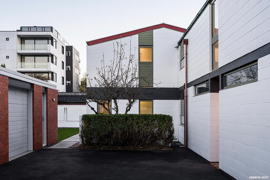
Winner Commercial Exterior Award + Colour Master Nightingale Award
The first event of this kind in four years, there were plenty of reasons to celebrate the colourful achievements of the latest Resene Total Colour Award winners together on the runway during New Zealand Fashion Week. While selecting the cream of the crop from a fiercely competitive collection of outstanding projects is never an easy feat, this year saw the highest number of entries ever received – making for heated debate and rousing discussion among the judging panel in the quest to crown the best of the best examples showcasing Resene paints, wood stains and wallpapers. With Resene colours used creatively on projects large and small, combined with clever application techniques, courageous colour combinations and astounding attention to detail, there was much to love about this year's entries.
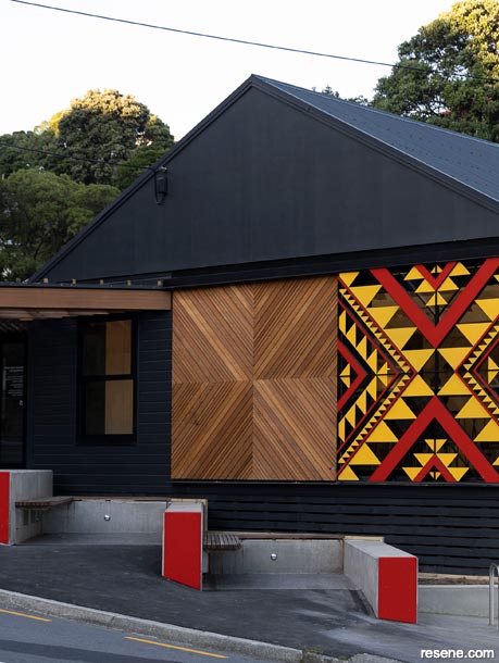
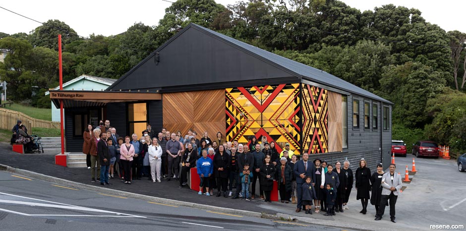
An inspiring transformation of the Strathmore Park Community Centre by Etch Architecture was honoured with this year’s Resene Total Colour Master Nightingale Award as well as the Resene Total Colour Commercial Exterior Award. Now known as Te Tūhunga Rau – Strathmore Park Community Centre, the upgraded centre features artful sliding doors designed by Pokau Kato Te Ahuru that provide a strong and enriching focal point to the public face of the building. The project’s bold palette of Resene colours, including Resene Double Foundry, Resene Element, Resene Flash Point, Resene San Juan, Resene Supernova and Resene Alabaster, is based on hues that hold prestige in Te Ao Māori and can be enjoyed as a shared experience inside or out – welcoming community members to gather, be nurtured and share values.
The judging panel, which included Sylvia Sandford (colour expert), John Walsh (previous editor of Architecture, architecture writer) and Laura Lynn Johnston (editor of BlackWhite magazine, previous editor of habitat magazine) lauded the quality and quantity of work that was shared. While not every project could be recognised with an award, they were astounded by the talent, creativity and effort that was evident in each submission.
Congratulations to all the winners and runners up and a huge thank you to each and every person who took the time to enter this year’s awards.
Etch Architecture
Te Tūhunga Rau – Strathmore Park Community Centre
Judges: “From ugly duckling to beautiful swan, this building was once a simple white structure that would barely raise a glance. Now, it has become a talking point, a local beacon and a celebration of the local community. Innovative and creative, this project is a moving feast of pattern and colour, with a corner of colour that can be moved and viewed in so many different ways. The judicious use of colour celebrates the hero colours to perfection with the rest of the building deliberately dark as a backdrop. Flashes of red on edges are the perfect finishing touch to connect all the elements together. The sliding doors so cleverly integrate bold colour and movement, allowing the hues to be viewed from the inside and out – an enduring gift of colour and design that can be enjoyed by all.”
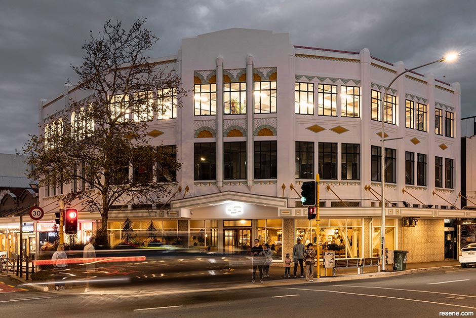
Foundation Architects Limited
191 Cuba Street
Judges: “Each colour chosen is complex and demands closer attention to appreciate the care and detail in their placement. This painstaking colour work has come together beautifully. The palette is deliberately understated, with just the right touch of colours in just the right places to energise the building by highlighting the forms without overwhelming them. Colour celebrates and brings the heritage to the fore.”
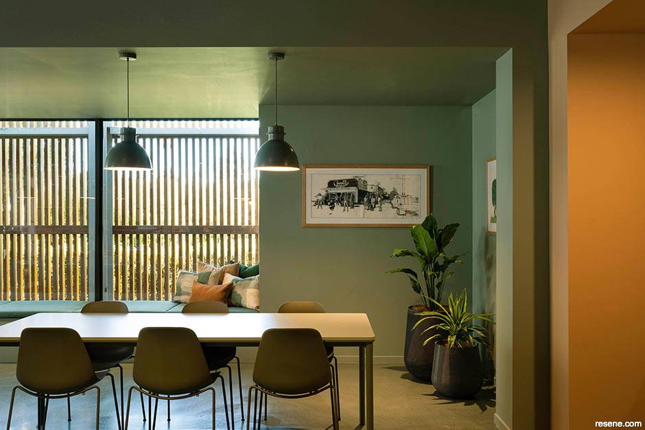
Blur the Lines
Comvita Paengaroa Workplace Design
Judges: “This palette brings a calm and soothing ambience, wholesomely earthy and perfectly aligned to the product category. The architecture and colour work in tandem to elevate the sense of wellness. Fashion colours are cleverly infused in places that can be easily updated in the future, providing scope for the palette to evolve with touches of new colour trends.”
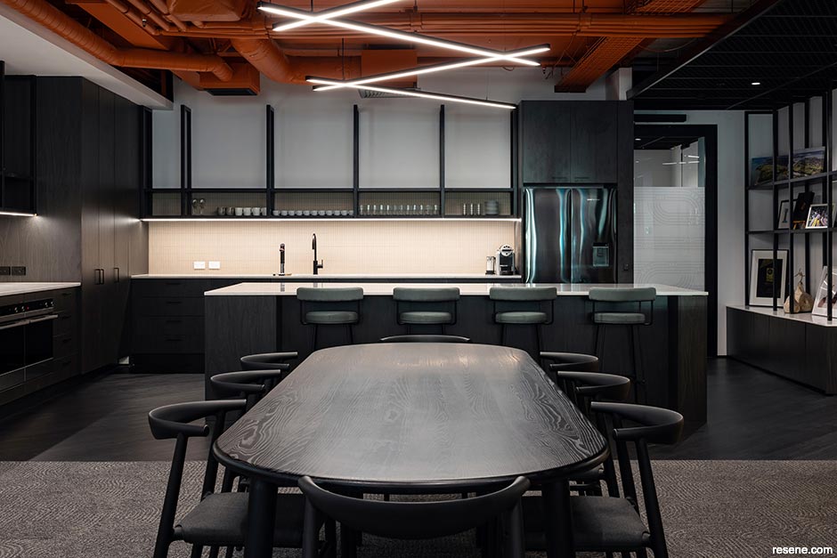
STACK Interiors
Ngāti Whātua Ōrākei
Judges: “Working with painstakingly selected hues of significance, this office is assertive, determined and purposeful with its perfectly picked palette. The bold painted ceiling draws eyes upwards to the structural element that wholeheartedly embraces the colour. The daring palette anchors the space yet is still warmly welcoming, enveloping you in a cocoon of colour.”
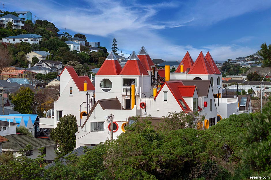
Roger Walker Architecture & Design Ltd
Park Mews, Hataitai
Judges: “When you reinvent a building with colour, it reminds us all of the influence of the building. The update gives it new life, celebrating the architect and the architecture. The carefully placed touches of bold colour draw attention to the idiosyncrasies of this home, inviting all to admire its charm. It’s enticing to young and old – a castle of dreams with a modern twist.”
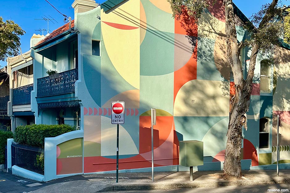
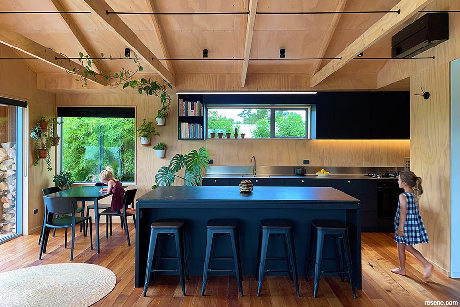
Lymesmith
Arc Angel
Judges: “This home reminds us all how overlooked surfaces can become heroes. With swathes of just the right amount of colour, this home has become an instant head turner, appealing and uplifting. The hues nod to nostalgia – they’re sweet, pretty and imminently approachable. The end wall combined with artistry and paint is a canvas of colour gifted to the neighbourhood for all to enjoy.”
Spacecraft Architects
Block Party
Judges: “The architecture invites owners to play with colour to provide each individual their own sense of identity within the whole. While the colours differ from home to home, they all share a similar synergy. The colour selections have successfully integrated with the architecture helping to claim territory, demonstrating how each can stake out their own space in a shared world.”
Max Warren Architect
Sandhill House
Judges: “In this home, less is more. There is a delightful playfulness with touches of colour in the most unexpected places. The colour plays up the structure, inviting you to look at the assembly of the home and find nuggets of colour treasure. The hues bring personality and a sense of fun and levity. The cheerful yellow floor is guaranteed to help start each day with a smile.”
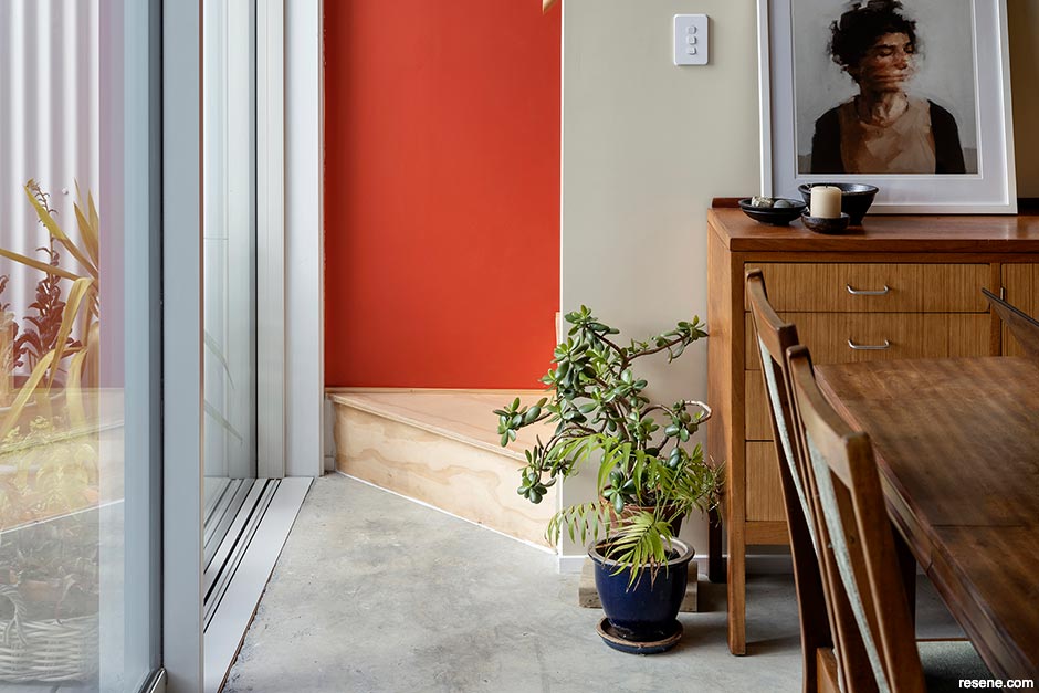
Cedar and Suede
Berry House
Judges: “The colours delightfully meander through this home, with a soothing sense of flow and continuity that leads you from one space to the next. The busy world outdoors is kept at bay with a soft palette of similar yet different hues that are soothing on the senses. It’s comfortable, nurturing and an ode to mindfulness.”
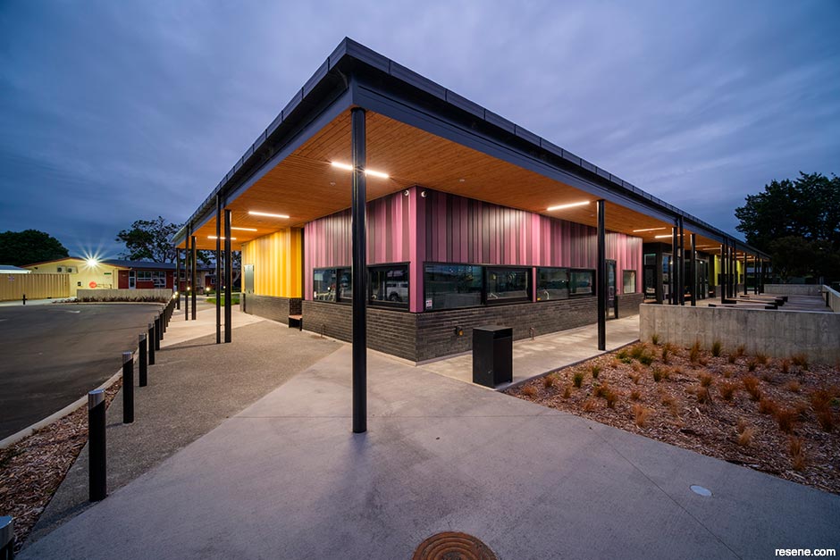
DCA Architects Limited
Heretaunga Intermediate School
Judges: “Colour lifts this school and signals its presence proudly to students, their families and the community. The exuberance of colour emphasises the strength of the vertical architecture, with carefully curated complementary colours adding welcoming warmth. The energetic colour combinations hint at the exciting opportunities that await each student to unlock their individual potential. A textbook use of colour.”
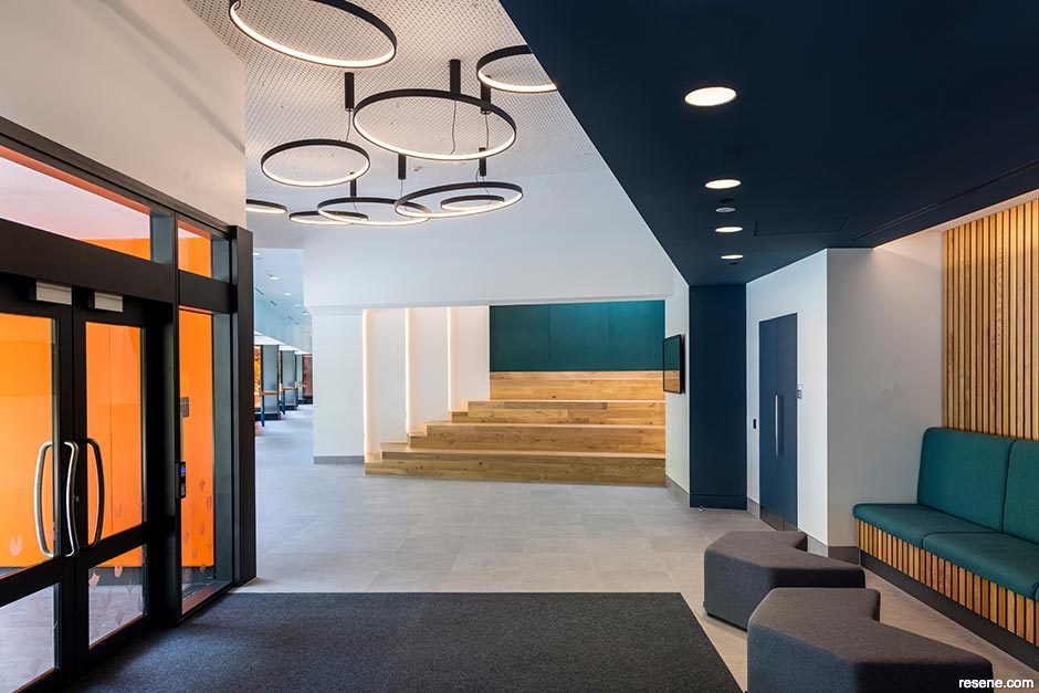
Lab-works Architecture in association with CCM Architects
Tāwharau Ora – Student Learning Complex
Judges: “This project strikes the perfect balance between the seriousness of the subject matter and the need for vibrancy to stimulate learning. Blocks of colour are defining, strong and purposeful, perfectly placed for maximum impact. The palette feels refined and grown up, supporting students as they progress to higher learning and growing independence in their transition to adulthood and career success.”
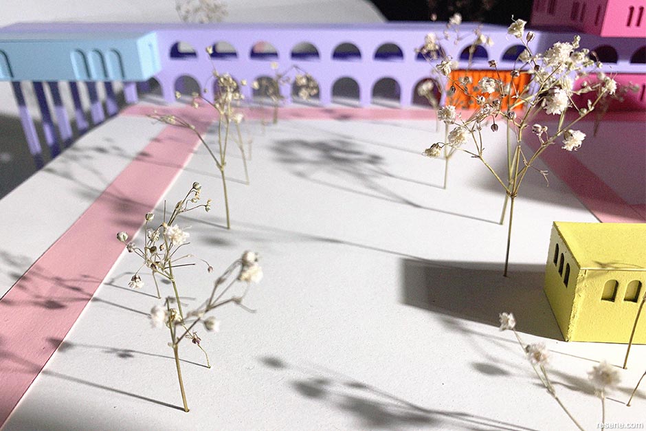
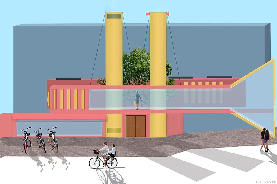
Madeleine Zwart
Architecture in a Playful Utopia
Judges: “Welcome to a world of colour that draws you in and makes you want to see more. Playing with dichotomy, this project is clearly defined, vibrant and playful with a delightful manipulation of colour. Hues have been carefully experimented with in the physical world to ensure best fit with form. The arches washed with colour are irresistible.”
Isabella Sagar
Let’s Revive Colour!
Judges: “Quirky and playful, yet mature and restrained, this project takes a considered approach to the architecture. The limited colour palette is used skilfully, with a sophistication that veers away from primary hues, manipulating tone and saturation for a more restrained approach. The curbed form softens the colour further, amplifying the appeal.”
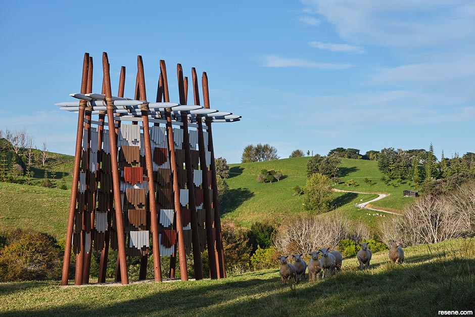
Chris Gandhi, Mathew Green, William Creighton and Seth Trocio
Te Reo o te Hau (The Voice of the Kōkōhau)
Judges: “At home in its landscape, this project and its palette are sensitive and sympathetic to its location – with interesting surprises. As movement creates light and shadow, the colours take on different interpretations and moods. The sophisticated variegation of colour helps to animate the wind as the work and the landscape interact with one another.”
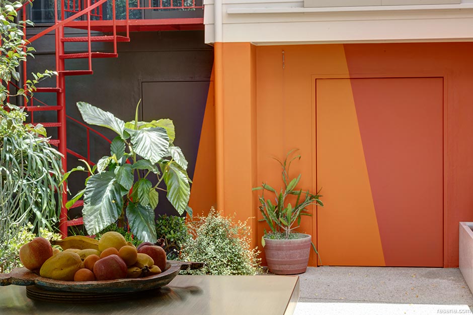
Lymesmith
Warm Vessel
Judges: “Carefully placed colour blocks help the external landscape become an extension of the interior, encouraging an indoor/outdoor lifestyle that flows freely. The palette is warm and inviting, personalising the backyard, giving it charming atmosphere and warmth. The celebration of sun-drenched bright colours contrast wonderfully with the foliage, inviting you to enjoy the outdoors all year round.”
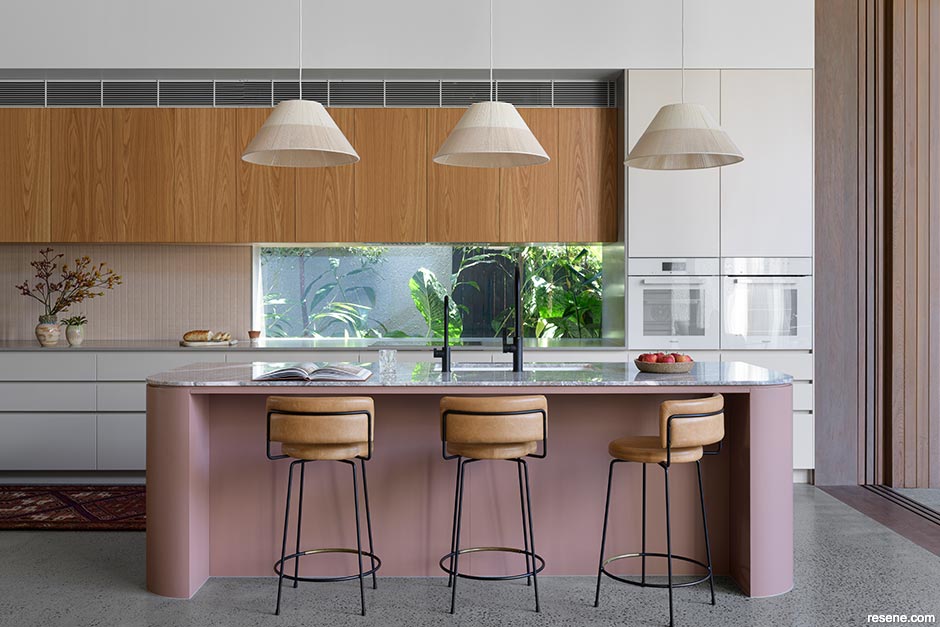
Studio Reno NZ
The Orewa Townhouse
Judges: “Relying on a neutral palette, this home shows the breadth of character you can create with a gentle wash of neutrals and layered, tone-on-tone accessorising. Each space is well defined and fused with individuality yet also flows beautifully from room to room. An unexpected twist of dark colour in the office wraps in around you to become a cosy companion while working.”
Kanat Studio
Orsini Atelier Space
Judges: “This space is very elegant from tip to toe. The colour is cohesively wrapped from surface to surface with texture and line used to create nuance and life in the colour. There is a wonderful, deep sense of airiness that brings with it a sense of comfort and calm, accentuated by the colour. It’s a breath of fresh air.”
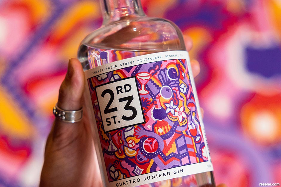
Lucinda Penn, LCND
Quattro Juniper Gin
Judges: “This painted work is so versatile and universally appealing, connecting the elements of the brand together in a form that can be used so easily across multiple touchpoints. The colours are cleverly inspired by the fruits of the product. In a world where so much is digital, the authenticity of this painted work taps into the appreciation of the artisan for an undeniably show-stopping bottle.”
Studio Pacific Architecture Limited
William Weir Wing Renovation
Judges: “Generations on generations have loved to live here. A building that keeps so many memories needs passion, attention and continuity to take it forward to the next generation without losing the charm of the previous generations. Respecting the heritage details, the palette successfully ensures that this home away from home will be home sweet home for many more years, and students, to come.”
Young Architects
Dorset Street Flats
Judges: “This is a very respectful treatment in revival, a fitting toast to the significance of the architect and his contribution to New Zealand. The work shows restraint and careful consideration of how to authentically refresh a piece of history. The palette honours the intention of the post-modern architecture, achieving the patina of the past with the technology of today.”
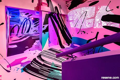
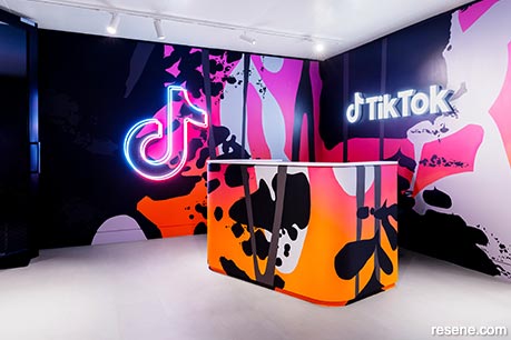
George Rose (Key Contributor: Eddie Zammit)
VIA Artists
Judges: “Incorporating a signature sweet fade, this project is sweet indeed. The palette and multi-tone colour effect brings a sense of summer casual, supporting the product range and immensely appealing to the store’s target market. It’s a huge achievement to so successfully and wholeheartedly capture the ombre of summer from tip to toe. Effective, eye-catching and exciting.”

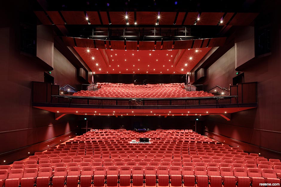
Shand Shelton and First Light Studio
Sir Howard Morrison Centre
Judges: “The colours chosen wrap around you. Whether you are alone or with a crowd, the hues are atmospheric, cocooning and comforting, encouraging you to relax, settle in and enjoy the show. The new foyer structure is simply glorious and sets the scene for what lies within. A clever melding of old meets new, this performing arts centre ticks all the right boxes.”
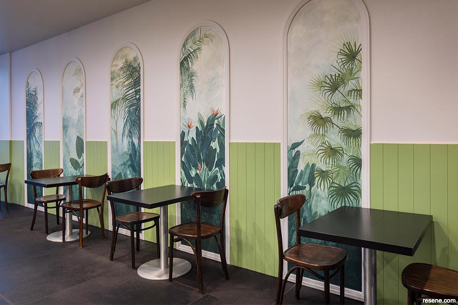
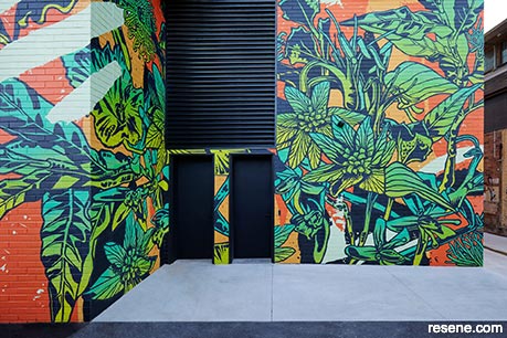
Pynenburg & Collins Architects
Kākāriki Coffee
Judges: “This humble café steps out of its comfort zone, exploring the use of related hues from blocks of colour on walls to works of art. Murals painted in tone-on-tone colours bring the great outdoors inside for all to enjoy. The combination of nature-inspired art, soothing hues and movement with colour makes this an undeniably pretty place to dine.”
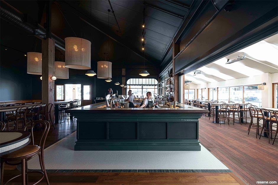
Izzard Design
Bivacco
Judges: “A strong sense of identity greets you at the door and is authentically embraced on every surface. The consistency of application of the design concept instantly transports you to another place and another time, wrapped in cultural cues. Deep, anchoring hues bring a sense of timelessness, encouraging you to take your time and enjoy all that is on offer.”
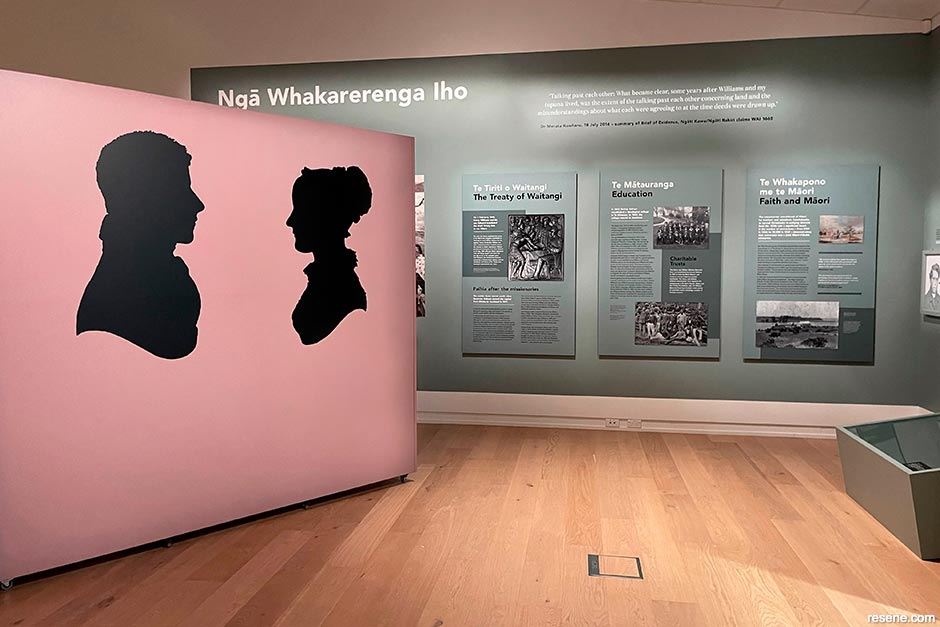
The Letter Q Ltd in collaboration with ObjectLab
From ‘saving souls’ to Te Tiriti o Waitangi: the Christian Missionary Society in Paihia 200 years on
Judges: “While we might often see bolder colours drawing attention to exhibits, it’s rare to see such considered pastoral colours that are so fitting of the subject matter. Colour brings the scale of the space and exhibition to a more human level and immediately places one back in time. The exhibition has a unique, ethereal and mystical feel with a sense of faded gentility. This colour palette is aged to perfection.”
George Rose
Judges: “Wherever George Rose goes, she leaves behind uplifting iconic works combining beautiful palettes of colours that brighten up each location. George’s sheer volume, range and quality of work combined with her mastery of colour and application techniques is extraordinary. So many projects are literally drenched in colour from tip to toe, leaving no surface untouched. Each is a feast for the eyes.”
Peta Tearle
It would be a hard job to find many who love colour as much as Peta did. And as much as Peta loved colour, she also loved to enthusiastically share her joy of colour with others and show them how they too could elevate their life, home and projects with colour.
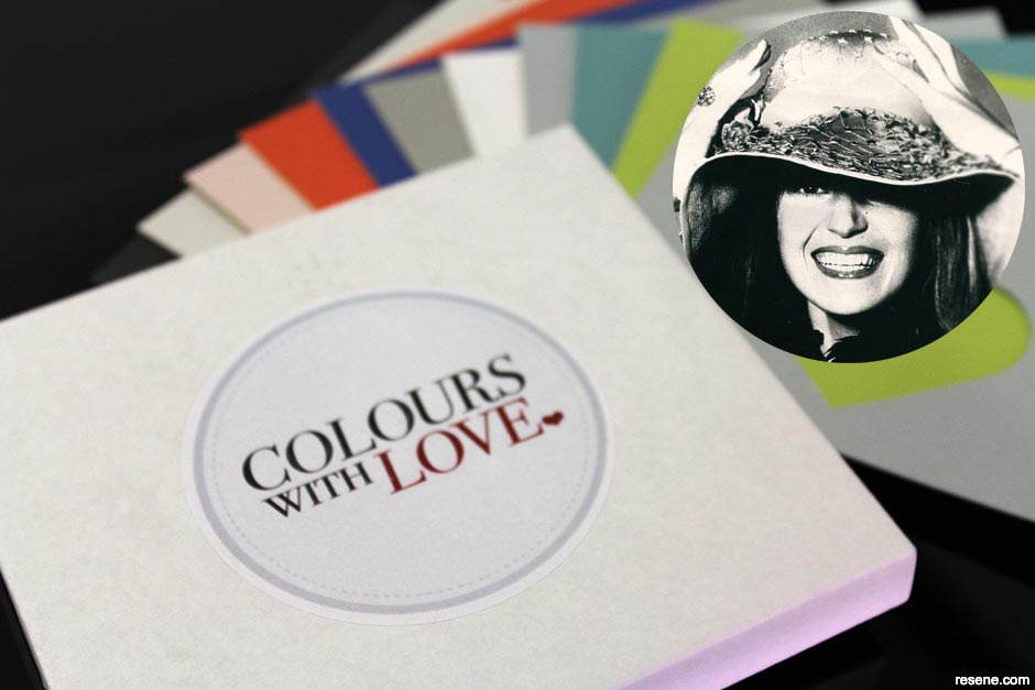
Peta had an innate ability to know exactly what dose of colour others needed, whether that be bold hues, soothing combinations of neutrals or something in between. Peta’s projects were always distinctive from one another because it wasn’t about what she liked to choose, but it was always about what was right for her clients. When Peta wasn’t helping her clients with their colour choices, she was helping her countless students to understand, master and love colour. And those many students have gone on to share Peta’s passion for colour with so many more, in their own homes, with their own clients and with their own students.
Recognising that so many people’s lives and spaces could be improved with colour, Peta created her own colour selection concept, Colours with love, to help people wherever they were in their colour journey to find colours they truly love and have the confidence to use them.
Peta has paid forward the use of colour, leaving a legacy of a fan club of clients, students and industry admirers, who have all been inspired to bring more colour into their projects and their lives. Peta really did live a life in full colour and Peta’s lifetime passion for colour and this industry have been, and continue to be, an inspiration to so many.
Selected projects are featured in this issue of BlackWhite magazine. Keep an eye out for more on other projects in future BlackWhite and habitat by Resene newsletters and publications. For details on all of the Resene Total Colour Award winners, visit www.resene.com/awardwinners.
This is a magazine created for the industry, by the industry and with the industry – and a publication like this is only possible because of New Zealand and Australia's remarkably talented and loyal Resene specifiers and users.
If you have a project finished in Resene paints, wood stains or coatings, whether it is strikingly colourful, beautifully tonal, a haven of natural stained and clear finishes, wonderfully unique or anything in between, we'd love to see it and have the opportunity to showcase it. Submit your projects online or email editor@blackwhitemag.com. You're welcome to share as many projects as you would like, whenever it suits. We look forward to seeing what you've been busy creating.
Earn CPD reading this magazine – If you're a specifier, earn ADNZ or NZRAB CPD points by reading BlackWhite magazine. Once you've read an issue request your CPD points via the CPD portal for ADNZ (for NZ architectural designers) or NZRAB (for NZ architects).
![]() Get inspired ! Subscribe
Get inspired ! Subscribe ![]() Get saving ! Apply for a DIY card
Get saving ! Apply for a DIY card
![]()
Can't find what you're looking for? Ask us!
Company profile | Terms | Privacy policy | Quality and environmental policy | Health and safety policy
Colours shown on this website are a representation only. Please refer to the actual paint or product sample. Resene colour charts, testpots and samples are available for ordering online. See measurements/conversions for more details on how electronic colour values are achieved.
What's new | Specifiers | Painters | DIYers | Artists | Kids | Sitemap | Home | TOP ⇧