From BlackWhite magazine - issue 07, green thumb
Barragán meets Corbusier in this vibrant hidden oasis.
Strolling down a residential street in one of Sydney’s inner-city neighbourhoods, it’s easy to appreciate the charming filigree and lacework-adorned façades of the metropolitan’s many iconic terrace houses without much thought for what might lay behind them. Unless you’re lucky enough to visit or live in one of these covetable townhouses, their secret gardens often remain mysteries concealed by long, unbroken blocks. But while their yards may be compact, most of these dense urban dwellings are not without their own private slice of paradise where their homeowners can take breakfast or escape from the world after a long day. Despite being in the middle of one of Australia’s busiest cities, they’re often surprisingly quiet thanks to their walled-in nature. And with a bit of artistic vision, they can become a spectacular outdoor living space that feels like an extension of the home.
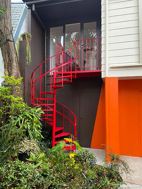
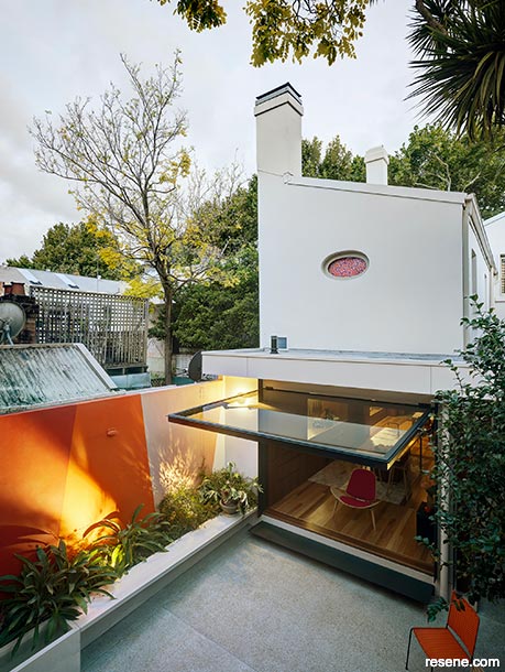
Sonia van der Haar, the multi-talented force behind award-winning design practice, Lymesmith, has performed her signature magic on a number of Sydney projects. Recently, her colour mastery was put to work in a surprisingly impactful intervention within a courtyard garden of a Darlinghurst terrace house. Since the majority of Sydney’s authentic terrace houses are from the Victorian and Edwardian era and were built between the 1850s and 1890s, these historical gems understandably require diligent repairs and refurbishment in order to maintain them. This particular terrace house was treated to an extensive renovation led by Sam Crawford Architects, which included the installation of large windows and openings to improve the visual and spatial indoor-outdoor connection, repainting the courtyard and improvements to landscape design by Landscape Architect Sue Barnsley.
When the clients first brought up the idea of introducing some colour into the courtyard, it was Sue who recommended they reach out to Sonia. “Sonia is synonymous with colour. We had worked together at Prince Alfred Park and Pool and I loved the way she thinks with colour, so we knew Sonia was perfect for this project,” says Sue.
Sonia’s project scope included selecting colour for the rear walls of the terrace house, the side boundary walls and the façades of the studio and garage building that form the rear boundary enclosing the courtyard. Some of the established trees and plants were already in place during the planning stage, but Sonia was also able to reference Sue’s design drawings to see where future plantings would be added.
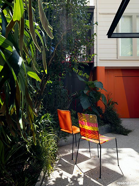
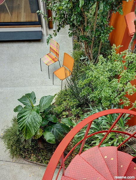
For the clients, the courtyard is an oasis which gives them a lot of enjoyment. Going into the renovation, it was not something they had planned but it became a key feature of their final outcome and enhanced the rest of the renovation. Since the surfaces needed to be repainted anyway, they decided to enhance the garden walls to provide a backdrop to their plantings, which are predominantly shades of green.
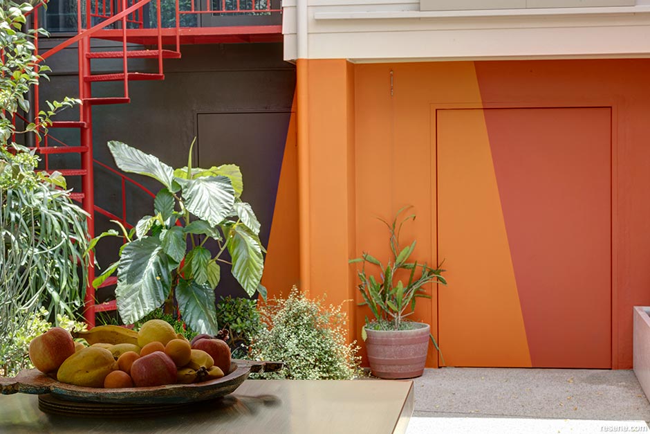
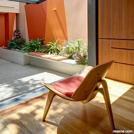
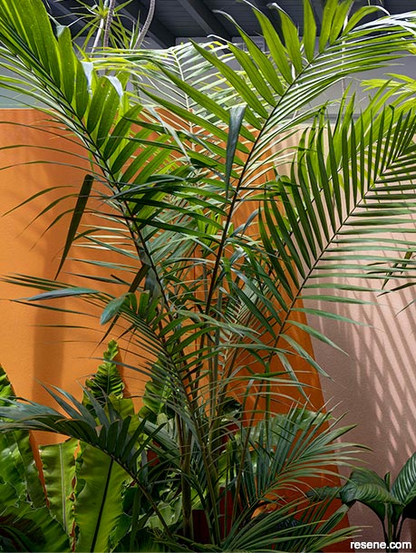
“In these inner-city blocks, courtyards are usually leftover spaces which are overlooked and overshadowed,” says Sonia. “But when well-designed and inviting, they can become another room in the house – just without a roof. I was given the task of investigating possibilities for colour on the walls in the garden space, something that was not exactly a mural but more than just a single colour. I looked at the walled garden as a tiny oasis which needed to feel very welcoming and complementary to the internal spaces from which the courtyard is mostly seen. Internally, the house features beautiful finishes in timber, brass and stone with interior walls in a soft shade of white, all selected by the architects. These interior finishes frame views to the garden. During the renovations, old red brick garden pavers were replaced with a white cement slab. Concerned that this may make the space feel too cool and less inviting in winter, I felt that a warm palette would best complement the warm neutral tones of the interior architecture and the deep greens in the lush garden.”
The clients started with a number of ideas for the wall painting, ranging from an army camouflage pattern to a design influenced by Mexican Architect Luis Barragán. “The clients had seen a documentary on Barragán. They loved the simplicity of planes of colour set against the landscape, as in his Cuadra San Cristóbal project,” says Sonia. “The angled shapes painted on the wall were inspired by the shape of the distinctive stone tile used throughout the house – an elongated hexagon, which looked to me like an elegant clay vessel. I based my custom Resene paint colours on Le Corbusier’s 1931 colour range, because they are distinctive earth tones yet have wonderful depth and hue intensity.”
While earthy, the hues from Le Corbusier’s 1931 colour range are also vibrant and complex. Sonia worked with Resene to come up with four custom hues – a medium red ochre, an orange, a cinnabar red and a burnt umber – to get just the right tones. “We used Resene Lumbersider Low Sheen for the deeply coloured garden walls, due to its suitability and lightfastness on exterior surfaces. Given the urban environment, where surfaces get dirty quickly, Resene Lumbersider Low Sheen ended up being a good choice from a maintenance perspective. We used Resene AquaShield mineral effect finish tinted to Resene Triple Blanc to give a more ‘heritage appropriate’ look to the house and studio façades.”
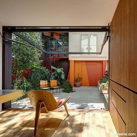
Sonia says her favourite thing about the new coloured courtyard walls is how they are seen from inside the house and how they produce interesting views and colour effects within it while amplifying the indoor-outdoor connection. “The colour shines and spills, changing with weather, time of day and season. It has the effect of making the interior of the house feel larger even though the site boundary is explicit. I think it works because the eye is drawn outside by the unexpectedly rich colour, somehow giving the impression that the boundary of the room is not the walls of the house but the walls of the courtyard beyond.”
“It was a curious reversal of what you may expect,” she adds. “Warm colours advance and cold colours recede, right? The way colour acts on a building, the way it can emphasise or de-emphasise a particular aspect of architectural form is something I study and think about a great deal. And generally speaking, I’m confident in saying that cool colours produce a more spacious feeling than warm colours. However, when colour is applied in three-dimensional environments such as architecture, there are multiple factors and complexities affecting the behaviour of those colours. Simplistic rules of thumb can be useful starting points, but they are not always correct as decision-making tools. In this instance, the warm colours have expanded the perception of the space.”
As with all Lymesmith projects, the thought that Sonia puts into her colour selection is fundamental to their success. Her considered approach and commitment to getting just the right hues that would lend the courtyard complete cohesion within the greater renovation design caught the attention of the judges at this year’s Resene Total Colour Awards, and the project took home the Resene Total Colour Landscape Colour Maestro Award.
For Sue, the finished design brings to mind a similarly vibrant paradise in Marrakesh. “The use of colour on the perimeter walls enlivened the garden and made a wonderful backdrop for an eclectic mix of plants – much in the same way Jardin Majorelle is transformed with colour.”
For Sonia, the courtyard has offered new ways of thinking that she’ll be able to apply to petite projects in the future. “I’ve learned there is huge potential to play with colour in these small urban spaces to make pockets of outdoor space into extensions of the interior space and really make them more appealing to be in. When colours selected for the exterior relate to the interior, it opens up all kinds of interesting possibilities that are ripe for exploration.”
Top tips:
When specifying a dark colour outdoors, ask for it to be tinted into a Resene CoolColour formula. A Resene CoolColour looks like a normal Resene colour, but thanks to special pigment technology, it reflects more heat so that it doesn’t get as hot as the normal colour would.
If you can’t find the exact colour you’re looking for within Resene’s extensive colour library, Resene can create a free custom colour for you. Your custom colour can be named with your chosen colour name and entered in the Resene e-tint system so you can easily get your colour tinted again in the future, either at the same Resene ColorShop or another one.
If your client has a specific inspirational image they want you to reference, turn it into a Resene colour palette quickly and easily with the free online Resene Colour Palette Generator. Simply upload your image to get a customised Resene colour palette based on the most common colours that occur. Plus, the tool tells you what proportion each hue has in the palette to help give you an idea of how to balance your colour choices. Once finished, you can click on the colours for more information, download swatches or save or email your palette to clients or project team members. Try it out at www.resene.com/palettegenerator.
Courtyard mural design: Lymesmith
Architectural design: Sam Crawford Architects
Landscape design: Sue Barnsley
Build: SQ Projects
Painting: Top Touch Painting Services
Images: Brett Boardman
This is a magazine created for the industry, by the industry and with the industry – and a publication like this is only possible because of New Zealand and Australia's remarkably talented and loyal Resene specifiers and users.
If you have a project finished in Resene paints, wood stains or coatings, whether it is strikingly colourful, beautifully tonal, a haven of natural stained and clear finishes, wonderfully unique or anything in between, we'd love to see it and have the opportunity to showcase it. Submit your projects online or email editor@blackwhitemag.com. You're welcome to share as many projects as you would like, whenever it suits. We look forward to seeing what you've been busy creating.
Earn CPD reading this magazine – If you're a specifier, earn ADNZ or NZRAB CPD points by reading BlackWhite magazine. Once you've read an issue request your CPD points via the CPD portal for ADNZ (for NZ architectural designers) or NZRAB (for NZ architects).
![]() Get inspired ! Subscribe
Get inspired ! Subscribe ![]() Get saving ! Apply for a DIY card
Get saving ! Apply for a DIY card
![]()
Can't find what you're looking for? Ask us!
Company profile | Terms | Privacy policy | Quality and environmental policy | Health and safety policy
Colours shown on this website are a representation only. Please refer to the actual paint or product sample. Resene colour charts, testpots and samples are available for ordering online. See measurements/conversions for more details on how electronic colour values are achieved.
What's new | Specifiers | Painters | DIYers | Artists | Kids | Sitemap | Home | TOP ⇧