From BlackWhite magazine - issue 07, neutral ground
Use these nuanced Resene whites and neutrals to enhance your next project.
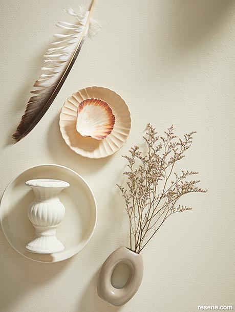
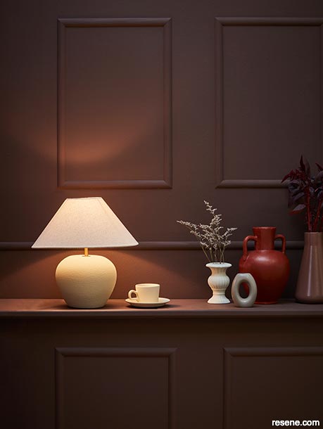
Complex whites like Resene Creme De La Creme have nuanced undertones that can work with a range of accent colours, but this hue works particularly well as a backdrop to red-and-green-toned accents – including subtly-coloured ones like Resene Athena and Resene Courtyard.
Round plate and vase painted in Resene Creme De La Creme, scalloped plate in Resene Athena and ring vase painted in Resene Courtyard. Projects by Amber Armitage, images by Wendy Fenwick.
Ever since the last of the mandatory pandemic-curbing measures were lifted, a spectrum of bold hues began flooding our colour forecasts – and it makes sense, when you think about it. After being stuck at home for months on end, many of us were ready to shake things up in big ways and infuse more energy into our spaces and wardrobes. But despite the prevalence of show-stopping shades of prominent pinks, conspicuous chartreuses, remarkable reds and vivid violets within the design world, neutral paint colours will always be popular for the important functions they serve. Whether they’re set to play a starring or supporting role in your colour scheme, neutrals are necessary for increasing balance, practicality, liveability and flexibility.
Neutral paint colours are often praised for their timelessness, however, that doesn’t mean they’re immune from the ebb and flow of trend patterns. In fact, the two are more closely connected than most realise. You might be aware of the warming and cooling trends that neutrals generally cycle through every one or two decades, and that warm tones are currently being favoured. But not all warm white, cream, beige, greige, taupe and brown paint colours should be considered ‘on trend’ at the moment. The key to selecting the right neutral to use now lies in picking ones with the right undertones, which are hugely influenced by today’s aforementioned bolds and brights. Focusing on neutrals with similar or complementary undertones is an essential strategy for choosing options that will sit beautifully with your design’s hero hue without the risk of selecting ones that are better left in decades past.
Confident reds like Resene Pioneer Red are among today’s hottest trending hues, so it’s becoming increasingly likely that your clients will be wanting to incorporate it or a similarly strong red in an upcoming project. Rather than leaning back on the uber-neutrals you might be more accustomed to specifying, take a more colour-savvy approach and build out your palette with red-or-green-edged Resene character neutrals like Resene Athena, Resene Courtyard, Resene Creme De La Creme, Resene Stepping Stone, Resene Rebel, Resene Bask and Resene Deep Oak. Regardless of whether you and your client want the space to take on a mainly light, medium or deep base, this collection of colours can be carried across your project in different ratios and still provide effective contrast and interest while playing to the strengths of your accent hue – as these projects prove.
did you know? Along with popular accent colours, you’ll also find a selection of today’s top trending neutrals in the latest Resene The Range fashion colours collection. Or look to the Resene The Range Whites & Neutrals collection for hundreds of contemporary and classic choices that span from whites and offwhites through to blacks and off-blacks.
When faced with hundreds of neutrals to choose from, look first to Resene colour cards that share an undertone in common with your planned hero hue or sit opposite from it on the colour wheel. For example, to support accents in a strong red like Resene Pioneer Red, neutrals with red or green undertones will often complement it best. Resene makes this easy with its colour coding – look for colours with R for Red or G for Green at the start of the colour code.
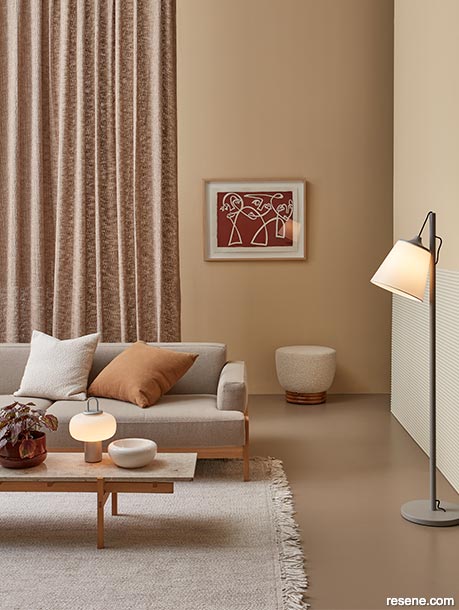
Back wall and upper right wall painted in Resene Athena, floor in Resene Courtyard and lower right wall panelling in Resene Creme De La Creme. Sofa, coffee table, bowl and table lamp from Good Form, floor lamp, cushions and rug from Bauhaus, plant pot and saucer from Smith & Caughey's, ottoman from Soren Liv, artwork by Claire Stapleton, curtain from James Dunlop.
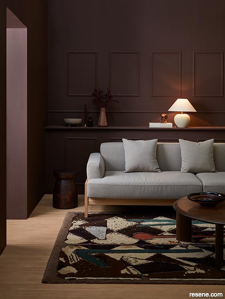
Deep browns with multifaceted red and purple undertones like Resene Rebel feel particularly contemporary since they share tones in common with today’s most popular accent hues. Plus, the hue makes a striking backdrop to the ‘safe’ colours clients are likely to opt for when selecting investment furniture.
Walls painted in Resene Rebel, floor finished in Resene Colorwood Bask, lamp base in Resene Athena and stool in Resene Colorwood Deep Oak. Raised dish, book and plate from Smith & Caughey’s, sofa, coffee table, rug, flask vase and dog ornament from Good Form, flowers from Urban Flowers.
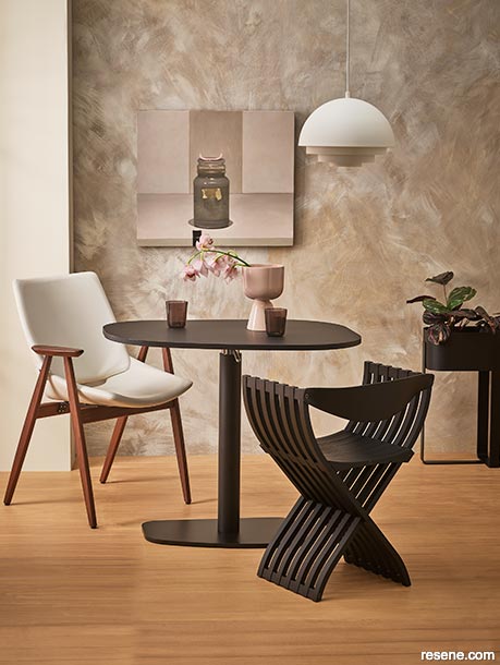
Conversely, applying a paint effect to a smaller architectural feature within a lighter backdrop brings interest while maintaining a lighter, minimalistic vibe.
Left wall and back wall painted in Resene Creme De La Creme, right pillar painted in Resene Creme De La Creme with Resene FX Paint Effects Medium mixed with Resene Courtyard applied on top, sculpture in Resene Creme De La Creme and floor finished in Resene Colorwood Bask. Chair and lamp from Matisse, console and rug from Ligne Roset, vase from Smith & Caughey’s, flowers from Urban Flowers.
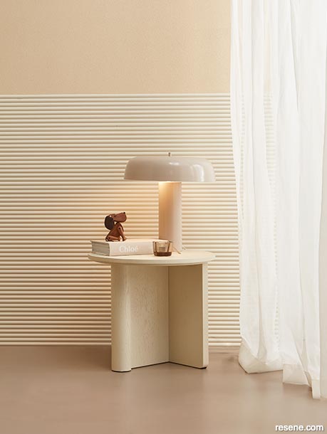
In a more neutral iteration of this palette – which only features a single pale pink accent – using multiple neutral Resene paint colours to create a paint effect on a key wall brings vital texture and interest to the space and creates an air of intimacy.
Back wall painted in Resene Creme De La Creme with Resene FX Paint Effects Medium mixed with Resene Courtyard applied on top, left pillar in Resene Courtyard and floor finished in Resene Colorwood Bask. Artwork by Damien Kurth from Sanderson Gallery, left chair and pendant lamp from Good Form, right chair, table and plant stand from Ligne Roset, vase from Smith & Caughey’s, glassware from Tessuti.
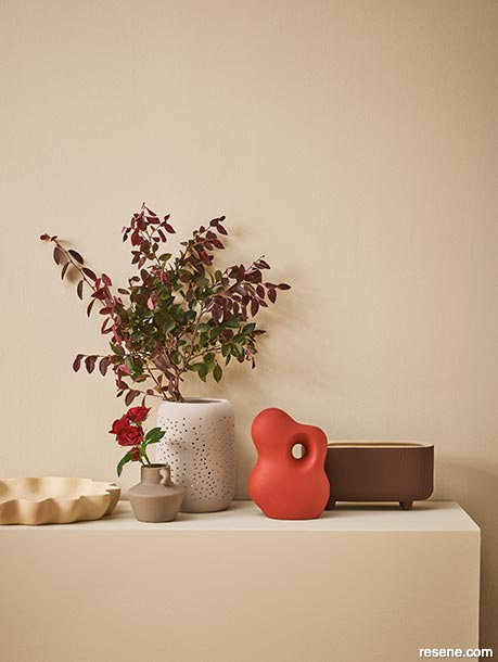
Many clients will opt for mid-range tones on walls when they want to add a colour but are hesitant of going too dark. In these spaces, keep in mind that you will need to layer in lighter and darker accent colours to achieve adequate interest through contrast.
Walls and shelf painted in Resene Creme De La Creme, wavy plate in Resene Athena, small jug vase in Resene Courtyard, large vase in Resene Stepping Stone, sculpture painted in Resene Pioneer Red and planter in Resene Rebel.
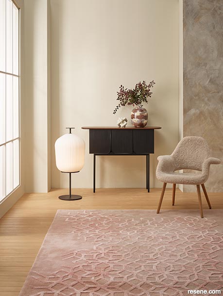
Using a more pigmented mid-range neutral as your floor colour can add necessary grounding to airier wall colours like Resene Creme De La Creme and Resene Athena.
Upper wall painted in Resene Athena, lower wall panelling in Resene Creme De La Creme and floor in Resene Courtyard. Table and lamp from Soren Liv, dog ornament from Good Form, book and candle from Smith & Caughey’s, curtain from James Dunlop.
Choosing deep neutral tones to paint and stain major surfaces is a surefire way to create cosiness. Opt for Resene SpaceCote Low Sheen or flat formulas for a velvety effect and be cognisant of light sources, temperature and direction as well as window coverings to avoid glare.
Walls, trim and shelf painted in Resene Rebel, lamp base, cup and saucer in Resene Athena and vases (from left to right) in Resene Creme De La Creme, Resene Courtyard and Resene Pioneer Red. Flask vase (far right) from Good Form, flowers from Urban Flowers.
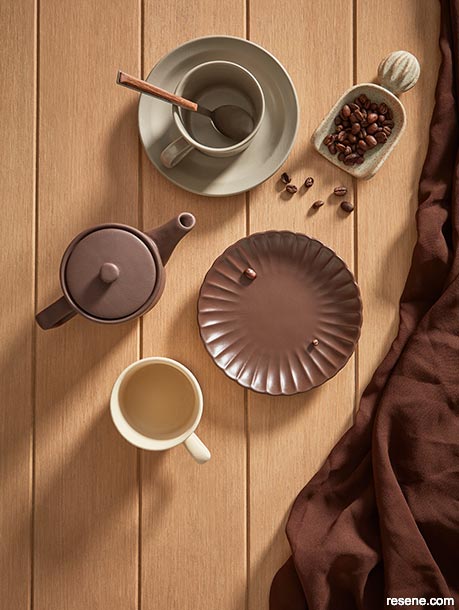
Colourwash finishes like Resene Colorwood Bask lend timber flooring a softer effect while still allowing the wood’s inherent grain to bring a touch of texture to your design.
Background finished in Resene Colorwood Bask, cup and saucer painted in Resene Courtyard, teapot and scalloped plate in Resene Rebel and mug in Resene Athena.


This is a magazine created for the industry, by the industry and with the industry – and a publication like this is only possible because of New Zealand and Australia's remarkably talented and loyal Resene specifiers and users.
If you have a project finished in Resene paints, wood stains or coatings, whether it is strikingly colourful, beautifully tonal, a haven of natural stained and clear finishes, wonderfully unique or anything in between, we'd love to see it and have the opportunity to showcase it. Submit your projects online or email editor@blackwhitemag.com. You're welcome to share as many projects as you would like, whenever it suits. We look forward to seeing what you've been busy creating.
Earn CPD reading this magazine – If you're a specifier, earn ADNZ or NZRAB CPD points by reading BlackWhite magazine. Once you've read an issue request your CPD points via the CPD portal for ADNZ (for NZ architectural designers) or NZRAB (for NZ architects).
![]() Get inspired ! Subscribe
Get inspired ! Subscribe ![]() Get saving ! Apply for a DIY card
Get saving ! Apply for a DIY card
![]()
Can't find what you're looking for? Ask us!
Company profile | Terms | Privacy policy | Quality and environmental policy | Health and safety policy
Colours shown on this website are a representation only. Please refer to the actual paint or product sample. Resene colour charts, testpots and samples are available for ordering online. See measurements/conversions for more details on how electronic colour values are achieved.
What's new | Specifiers | Painters | DIYers | Artists | Kids | Sitemap | Home | TOP ⇧