From BlackWhite magazine - issue 07, spectrum science
Why understanding the difference between physical and digital Resene colour samples is integral to your design.
There’s a common conundrum that many designers, builders, painters and others who need to specify and use paint are faced with. Perhaps you’ve found an eye-catching colour online that’s inspired your decorating palette or maybe you have a client who wants a painted part of their project to perfectly match their brand colours and now you’re unsure how to translate that colour from the digital world to the physical space you’re working on. Those who are familiar with popular design software can likely figure out a colour’s RGB or HEX value, which can be a great place to start when you’re in the initial stages of design. While electronic colours are a superb way to visualise your project’s colour scheme prior to painting, it’s important to understand that they are not substitutes for physical colours as they are fundamentally different.

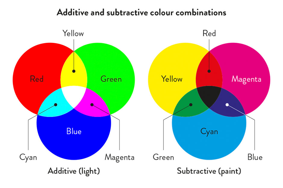
Mixing paint colours is called subtractive colour, as the colour you see is the colour that the paint does not absorb. For example, yellow paint appears yellow because it absorbs all colour waves except yellow. Mixing light-emitting colours, such as RGB values, uses the principle of additive colour. Light-emitting devices such as computer monitors, smart phones or television screens ‘give out’ colour, so even if the room you’re in is completely dark, you can still turn them on and see colour. RGB is an acronym for ‘Red, Green, Blue’, which are the three colours that get layered with white light to create the different hues you perceive on a screen.
A HEX colour is expressed as a six-digit combination of numbers and letters that are defined by the hue’s mix of red, green and blue – so HEX colour codes are simply shorthand for an RGB colour. Since RGB colours can have up to nine digits and given that human brains struggle with remembering numbers greater than seven digits, HEX colours codes can be easier to recall and communicate.
CMYK stands for ‘Cyan, Magenta, Yellow, Black’ and is often used by printers and graphic designers to print things like artwork, magazines and marketing materials. Whether you are viewing a digital representation of CMYK, the computer is trying to emulate what a sample might look like after it comes off of a printing press. Like paint, CMYK is a subtractive colour model, however, it uses a combination of four layers of coloured ink to achieve a hue (which is also known as four-colour process).
Due to these different colour systems and their limitations, some paint colours can be portrayed on screens more accurately than others. Despite monumental technological improvements in screen technology, there are still limitations in the range of colours that can be shown in the RGB colour space. This means that some Resene paint colours do not convert as well as others because they are out of gamut of the RGB colour space. These differences are not faults in the conversion or software, simply limitations between additive colour spaces when compared with subtractive colours.
Previously, Resene’s RGB values were measured from dry painted colour samples using sophisticated electronic colour scanning equipment. These RGB values were then converted to LAB and CMYK. But today, Resene derives LAB values from colour master paint samples to come up with the base colour value to represent each hue in the Resene Total Colour System. This shift improved the accuracy of Resene’s digital colours because it means Resene starts with the largest colour space then converts it to smaller colour spaces like RGB, HEX and CMYK using a mathematical equation.
RGB and CMYK colour spaces specify a colour by telling a device how much of each colour is needed. LAB, on the other hand, is a more accurate colour space because it works more like the human eye and specifies colours using a three-axis system: the a-axis (green to red), b-axis (blue to yellow) and lightness axis. The best thing about LAB is that it’s easier to achieve the same colour across different media, which is why it’s often the colour space of choice for the plastics, automotive and textile industries.
top tip While colours can be converted from LAB to RGB, HEX and CMYK, when they are converted back to LAB, they may result in different values due to the mapping process. Reducing the number of colour conversions between colour spaces increases colour accuracy – so try to avoid switching between multiple colour spaces in your work whenever possible.
The digital Resene Colour Library has thousands of online colour swatches which can be easily searched to find the nearest approximate RGB, HEX, CMYK and LAB values to the one you’re referencing using Resene Find-A-Colour. This handy free tool even allows you to search within a specific colour chart or range to discover similar Resene colours to quickly narrow your options down to the best suggestions.
Once you have your nearest approximate Resene colour matches, it’s imperative that you view physical samples before making your final colour selection. Whenever possible, it’s best to trial your chosen colours in situ using an A4 drawdown paint swatch or a Resene testpot. These methods allow you to view a larger swathe of colour and see how the hue is affected by the project’s specific lighting circumstances and ensure you and your client are happy with your proposed match. If your project is yet to be constructed, Resene strongly recommends viewing a paint swatch of the colour, at the very least, to check the colour suits before finalising your specification. Resene drawdown paint swatches, paint chips and colour charts are screen-printed with real Resene paint so that you can be confident that what you see is what you’ll get.
top tip Resene ColorShops have colour libraries with A4 drawdown colour swatches that you can view in-store. This is a quick way to narrow down your electronic colour choices to those that look best in the physical world.
If you can’t find quite the colour you’re looking for, keep in mind that Resene can also create a free custom colour match from a physical sample – just bring it into any Resene ColorShop. This can be named with your chosen colour name and entered in the Resene e-tint system so you can easily get your colour tinted again in the future, either at the same Resene ColorShop or another one. This is especially helpful for nationwide branding projects or those that span the Tasman Sea, as your project’s painter can visit whatever Resene ColorShop suits them to access the same colour.
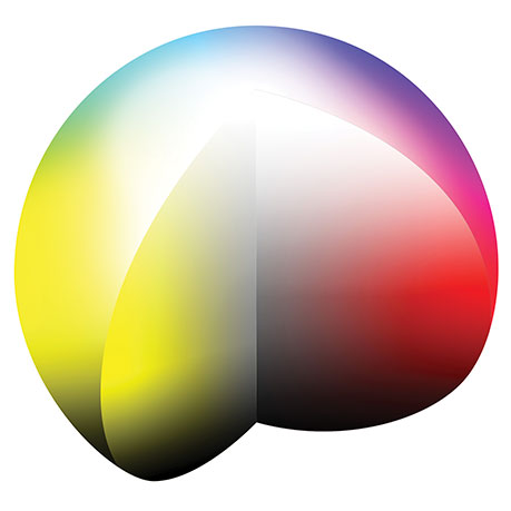
The LAB colour system expresses colours in three dimensions – lightness, rednessgreyness and yellownessblueness – so it’s best understood in the form of a sphere where gradations occur on X,Y and Z axes.
For those looking for a paint colour to match a Pantone (PMS) colour, Resene has already colour matched many PMS colours. You can view the ones already matched at www.resene.com/pantone. Resene ColorShops have a Pantone fandeck in-store for quick reference and can create other Pantone colour matches on request.
Although Pantone colours are created through a subtractive colour method, the colour space for Pantone and paint are not a perfect match. Some Pantone colours are brighter and cleaner than the materials to create paint colours allow. If your Pantone colour selections are very bright – particularly the ones that have a neon glow to them – you may need to choose a tonal variation for your paint to ensure best coverage and performance.
When matching other types of physical samples, such as multi-coloured fabrics, delicate artwork or three-dimensional décor objects, bring your item to your nearest Resene ColorShop. Resene staff can help you in-store or arrange with the Resene colour experts in the Resene Colour Lab to create a custom colour match for you.
Top tips:
Specifiers can order free A4 drawdown paint swatches by visiting www.resene.com/drawdowns and logging into your account. Testpots can be ordered online at shop.resene.com/testpots or visit your local Resene ColorShop.
Find the nearest approximate Resene colour match from a digital image or logo using the free Resene ColourMatch tool, www.resene.com/colourmatchonline. To create an entire palette inspired by an image, upload it to the free online Resene Colour Palette Generator at www.resene.com/palettegenerator.
Have you ever noticed when creating a mood board for a client how two different finishes or materials might appear to match under one light source but can look quite different when viewed under another light? This phenomenon is known as metamerism.
Metamerism is an optical illusion caused by differences in wavelength emissions between various light sources, such as incandescent versus fluorescent light. For example, incandescent lights transmit a lot of red wavelengths and very few blue wavelengths, which makes it tricky to tell whether the colour you’re viewing is black or dark blue. Fluorescent light, on the other hand, emits more blue wavelengths, so it’s easier to distinguish between black and dark blue. If a certain colour wavelength is not present, it cannot be reflected – which is why artificial lighting can have a drastic impact on the way we perceive a colour.
Paint colours, when viewed under different light sources, are also affected by metamerism, which is why it is so important to view real Resene paint colour samples in the space you plan to use them whenever possible. Resene A4 drawdown swatches can be moved about the room you intend to paint so that you and your client can view it under different lighting circumstances at different times of the day, both day and night.
Keep in mind that different surface characteristics, such as texture and gloss levels, will also affect colour as these surfaces reflect light back in different ways. The higher the gloss level on a surface and the smoother the surface is, the more reflective it is going to be – which will result in a brighter and cleaner colour. A flat white colour on a textured stucco wall will reflect light back in many different directions, and this diffused effect can make the white seem duller or darker. But the same white in a gloss finish applied to a smooth surface can appear brighter because more light is reflected directly back at the viewer.
did you know? The average human eye can perceive approximately one million distinct colours. Those with deficiencies such as colour blindness, certain diseases and age-related degeneration typically are able to perceive fewer colours while artists, colour specialists and those who work most of the day outside are sometimes able to see a greater number of distinct hues simply because they are exposed to more colours.


Project: Amber Armitage
Image: Wendy Fenwick
This is a magazine created for the industry, by the industry and with the industry – and a publication like this is only possible because of New Zealand and Australia's remarkably talented and loyal Resene specifiers and users.
If you have a project finished in Resene paints, wood stains or coatings, whether it is strikingly colourful, beautifully tonal, a haven of natural stained and clear finishes, wonderfully unique or anything in between, we'd love to see it and have the opportunity to showcase it. Submit your projects online or email editor@blackwhitemag.com. You're welcome to share as many projects as you would like, whenever it suits. We look forward to seeing what you've been busy creating.
Earn CPD reading this magazine – If you're a specifier, earn ADNZ or NZRAB CPD points by reading BlackWhite magazine. Once you've read an issue request your CPD points via the CPD portal for ADNZ (for NZ architectural designers) or NZRAB (for NZ architects).
![]() Get inspired ! Subscribe
Get inspired ! Subscribe ![]() Get saving ! Apply for a DIY card
Get saving ! Apply for a DIY card
![]()
Can't find what you're looking for? Ask us!
Company profile | Terms | Privacy policy | Quality and environmental policy | Health and safety policy
Colours shown on this website are a representation only. Please refer to the actual paint or product sample. Resene colour charts, testpots and samples are available for ordering online. See measurements/conversions for more details on how electronic colour values are achieved.
What's new | Specifiers | Painters | DIYers | Artists | Kids | Sitemap | Home | TOP ⇧