From BlackWhite magazine - issue 07, accent
Revived by pop culture, many designers are falling back in love with the power of pink.
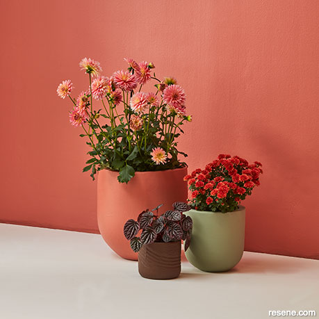
Terracotta pinks can be an appealing addition to an earthy colour palette of soft green, brown and white without feeling too stereotypically ‘pretty’.
Wall painted in Resene Soiree, floor in Resene Meringue and plant pots (from large to small) in Resene Soiree, Resene Field Day and Resene Allspice. Project by Amber Armitage, image by Wendy Fenwick.
Pink is a colour that carries with it a complex and fascinating history. The hue is often associated with notions of romance, love, beauty and playfulness, but the colour’s origins and evolution throughout the ages reveal a more intricate narrative.
The etymological roots of the colour’s name are cloudy, to say the least. Many believe the word ‘pink’ dates back to the 17th century in the English language and is said to have been derived from the Dutch word pinck, which referred to pinked edges. The term was used to describe the Dianthus genus (more commonly known as carnation), which were originally named ‘pinks’, as they often exhibit a scalloped – or ‘pinked’ – appearance on their petals. This is said to have led to the name of the flower being associated with the reddish colour their blooms often exhibit. In many other languages, including French, Dutch, Latin, Portuguese, Catalan, Spanish, Italian, Swedish, Norwegian, Hebrew, Russian, Polish, Bangla and Hindi, the colour pink is named after another flower: the rose.
However, if you go as far back as the 1400s, the pigment that the name ‘pink’ was first attached to was made from vegetable matter that created a murky greenish-yellow tinge. Luckily, the far more appealing reddish version of ‘pink’ has been the long-standing popular linguistic association.
The stereotypical gender associations with pink are a relatively recent development. For much of Western history, pink was considered a masculine colour. Men in England wore red uniforms, and since pink was viewed as a desaturated shade of red, pink ribbons and other decorations were often worn by boys (as they were simply considered small men). In fact, clothing for children throughout history was almost always white since, before the invention of chemical dyes in the 20th century, clothing of any colour would quickly fade when washed in boiling water. The introduction of the blue sailor suit – a uniform which was also white until the 1900s – is said to have played a role in the association of blue with boys’ clothing.
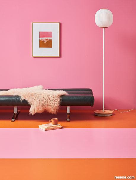
The key to making bubblegum pinks and bitter oranges feel contemporary lies in pairing them with simple, neutral furnishings that allow space for the hues to take centre stage.
Wall painted in Resene Hopbush and floor painted in Resene Moroccan Spice and Resene Hopbush. Sofa from Mr. Bigglesworthy, sheepskin from Baya, artwork from endemicworld. Project by Amber Armitage, image by Wendy Fenwick.
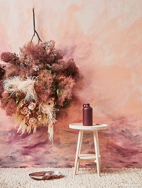
Multiple Resene pinks can be layered by using Resene FX Paint Effects Medium to give interior walls a soft and romantic painterly effect.
Wall painted in Resene Wax Flower with Resene FX Paint Effects Medium mixed with Resene Cab Sav and Resene Scotch Mist applied on top and vase in Resene Cab Sav. Side table from Good Form. Project by Amber Armitage, image by Wendy Fenwick.
These same advancements in chemical dye technology also led to pinks becoming brighter, bolder and more assertive in the 20th century. A key pioneer in the creation of the new wave of pinks was Italian designer Elsa Schiaparelli, who created a new variety of the colour in 1931 called ‘shocking pink’, made by mixing magenta with a small amount of white. The 1950s saw the rise of ‘bubblegum pink’, a playful and vibrant shade popularised by the pop culture of the time – and it wasn’t until this time that pink began to be used in the branding of girls’ toys in Western countries. However, in some other cultures, the hue is still seen as a masculine colour, associated with good health or symbolic of a warm embrace.
In architecture, the earliest pink buildings were usually built of brick or sandstone, which gets its blush hue from hematite or iron ore. In the 18th century, when pink and other pastels were having a heyday, pink mansions and churches were built all across Europe. More recently, buildings featured pink to appear exotic or to attract attention. Pink has been a popular colour for buildings in Mexico for hundreds of years while Jaipur, India is known as the Pink City due to the colour being the dominant hue used for exterior façades.
Following the recent record-shattering success of director Greta Gerwig’s film, Barbie, the popularity of pink for fashion and decorating has been renewed. It’s been widely reported that the set production resulted in a global shortage of pink paint pigment, and luckily for designers, that scarcity resolved in time for the film’s release – as seeing it has brought the colour back to the top of mind for many clients.
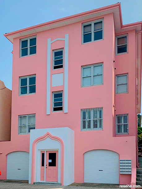
A tired-looking Bondi Beach apartment block was transformed into a dreamy vision in pink and white after the strata committee voted in a fresh Resene colour scheme.
Exterior walls painted in Resene Lumbersider Low Sheen tinted to Resene Petite Orchid, decorative arch on portico in half strength Resene Petite Orchid and white accents, trims and garage doors in Resene Sonyx 101 tinted to Resene Alabaster. Design and image by Kat Everett.
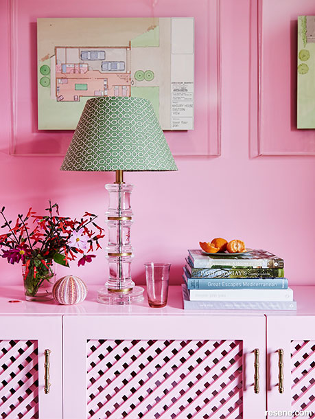
Pink is perfect for an on-trend colour-drenched look, where you take a single hue across all the major surfaces in a space from tip to toe.
Walls painted in Resene SpaceCote Flat tinted to Resene Cupid and storage console in Resene Enamacryl gloss tinted to Resene Cupid. Design by Coote & Co. Painting by The Lady Painters. Image by Lisa Cohen.
Whether you embrace pink for its playfulness or sheer visual appeal, it remains a colour that continues to captivate and inspire. Not only is pink a cosy and inviting paint colour that has been shown to have positive psychological effects, the hue’s ‘throw’ can create the visual effect of a younger and healthier complexion – making it a clever interior colour choice for walls and ceilings in bathrooms, spas and restaurants. A surprisingly versatile hue, the possibilities for colours to pair with pink are practically endless. For those new to specifying pink and looking to make the most of it, try these foolproof combinations:
Pink + Gold: This pairing exudes luxury and elegance. The shimmering warmth of gold complements the softness of pink beautifully, creating a regal and sophisticated ambiance. Try a dusted pink like Resene Valentine with Resene Gold Dust metallic or Resene Rose Gold metallic.
Pink + Red: A spin on a monochromatic colour scheme, red is a natural companion to pink. Choose hues that have a similar undertone, such as Resene Amped and Resene Inspire, for a well-suited pairing.
Pink + Blue: The contrast between pink and blue can be used to create a striking and balanced look. Navy blues such as Resene Ocean Waves add depth and seriousness to the playful nature of a pink like Resene Drop Dead Gorgeous, making it ideal for various design and fashion applications. But lighter blues like Resene Dream Big, Resene Timeless and Resene Sail Away are also trending picks for complementing rosy hues like Resene Awaken.
Pink + Mint Green: Popularised in the early 2000s, this fresh and lively pairing is perfect for spring and summer themes. The cool, calming effect of mint green harmonises beautifully with the vibrancy of pink. Try an apricot pink like Resene Dawn Glow with Resene Springtime for an updated twist on a classic Millennial combo.
Pink + Grey: For a modern and minimalist aesthetic, pink and grey make an excellent pair. The softness of pink contrasts with the neutrality of grey, resulting in a chic and contemporary feel. Choose a grey with a warm, slightly rosy undertone like Resene Kinship as a companion to a muted pink like Resene Summer Rose.
Pink + White: This classic combination is timeless, representing purity and simplicity. Using pink and white together, such as Resene Dust Storm and Resene Umber White, gives the impression of a cleanliness and freshness that’s fitting for updating the exterior of a historical villa.


Have you used a Resene pink in a recent project? Share it with us at editor@blackwhitemag.com.
This is a magazine created for the industry, by the industry and with the industry – and a publication like this is only possible because of New Zealand and Australia's remarkably talented and loyal Resene specifiers and users.
If you have a project finished in Resene paints, wood stains or coatings, whether it is strikingly colourful, beautifully tonal, a haven of natural stained and clear finishes, wonderfully unique or anything in between, we'd love to see it and have the opportunity to showcase it. Submit your projects online or email editor@blackwhitemag.com. You're welcome to share as many projects as you would like, whenever it suits. We look forward to seeing what you've been busy creating.
Earn CPD reading this magazine – If you're a specifier, earn ADNZ or NZRAB CPD points by reading BlackWhite magazine. Once you've read an issue request your CPD points via the CPD portal for ADNZ (for NZ architectural designers) or NZRAB (for NZ architects).
![]() Get inspired ! Subscribe
Get inspired ! Subscribe ![]() Get saving ! Apply for a DIY card
Get saving ! Apply for a DIY card
![]()
Can't find what you're looking for? Ask us!
Company profile | Terms | Privacy policy | Quality and environmental policy | Health and safety policy
Colours shown on this website are a representation only. Please refer to the actual paint or product sample. Resene colour charts, testpots and samples are available for ordering online. See measurements/conversions for more details on how electronic colour values are achieved.
What's new | Specifiers | Painters | DIYers | Artists | Kids | Sitemap | Home | TOP ⇧